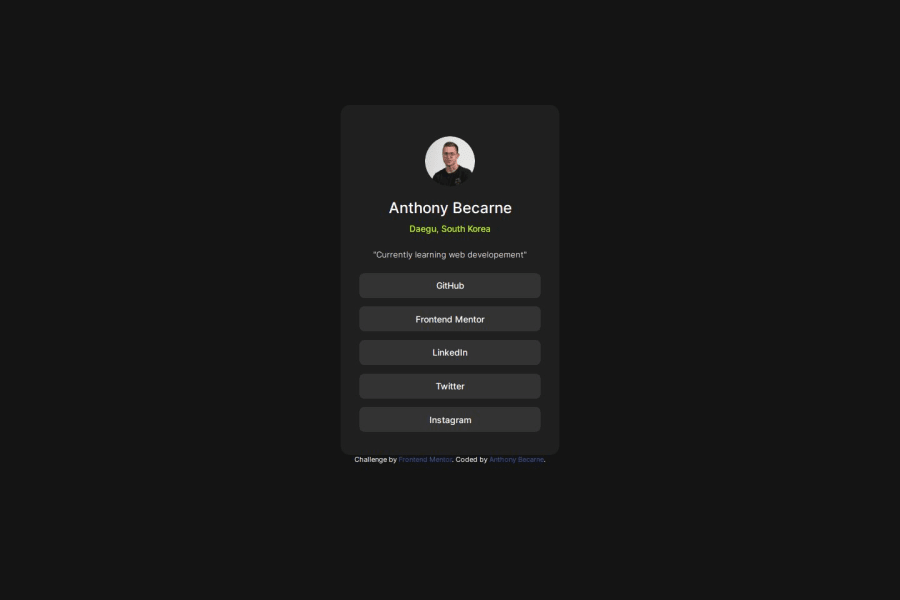
Design comparison
Solution retrospective
This one is the first time for me not using Figma. So i had to use my best judgment for styles such as width, height, padding, margin, etc. I think i did well enough to publish it
What challenges did you encounter, and how did you overcome them?N/A
What specific areas of your project would you like help with?Feel free to share any feedback :)
Community feedback
- @Devs-advocatePosted 12 months ago
Very nice work. I don't have figma, so I used microsoft powertoys screen ruler. I saw a youtuber using it recently and it worked great for me. It gives horizontal and vertical lengths in pixels. Best of luck in future.
Marked as helpful0@AbecarnePosted 12 months ago@Devs-advocate
Thank you very much for the tool!! It helped me a lot for an other challenge!
Wish you the best :)
0
Please log in to post a comment
Log in with GitHubJoin our Discord community
Join thousands of Frontend Mentor community members taking the challenges, sharing resources, helping each other, and chatting about all things front-end!
Join our Discord
