Design comparison
Community feedback
- @Xerver8694Posted 5 months ago
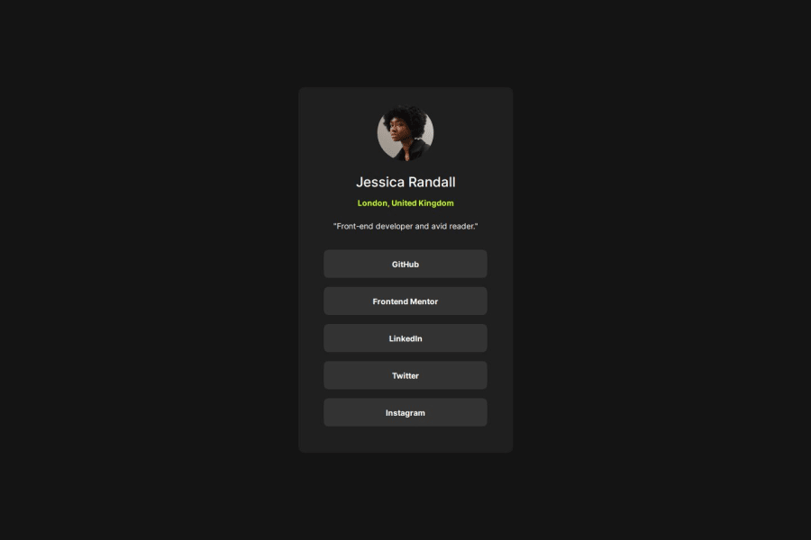
The code looks very easy to read through and debug, and the solution looks pretty much identical to the solution. Personally, I would have used buttons for the social links, but the way you have coded the list of links also works. If anything, it might actually be better than using buttons. Overall, excellent job. Happy coding!
Marked as helpful1@thaliawoodsPosted 5 months ago@Xerver8694 Thank you very much for your review! And yes, you are right about the buttons. I will change that :))"
0
Please log in to post a comment
Log in with GitHubJoin our Discord community
Join thousands of Frontend Mentor community members taking the challenges, sharing resources, helping each other, and chatting about all things front-end!
Join our Discord
