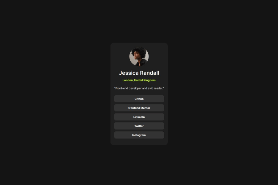
Design comparison
SolutionDesign
Solution retrospective
What are you most proud of, and what would you do differently next time?
not for much
What challenges did you encounter, and how did you overcome them?spacing
What specific areas of your project would you like help with?accessebility, i'm still learning
Community feedback
- @RealKendprPosted about 1 year ago
Well done. You might want to try centering it vertically as well, instead of just horizontally. That would be much better. You can use grid or flex or absolute positioning to center.
Marked as helpful0
Please log in to post a comment
Log in with GitHubJoin our Discord community
Join thousands of Frontend Mentor community members taking the challenges, sharing resources, helping each other, and chatting about all things front-end!
Join our Discord
