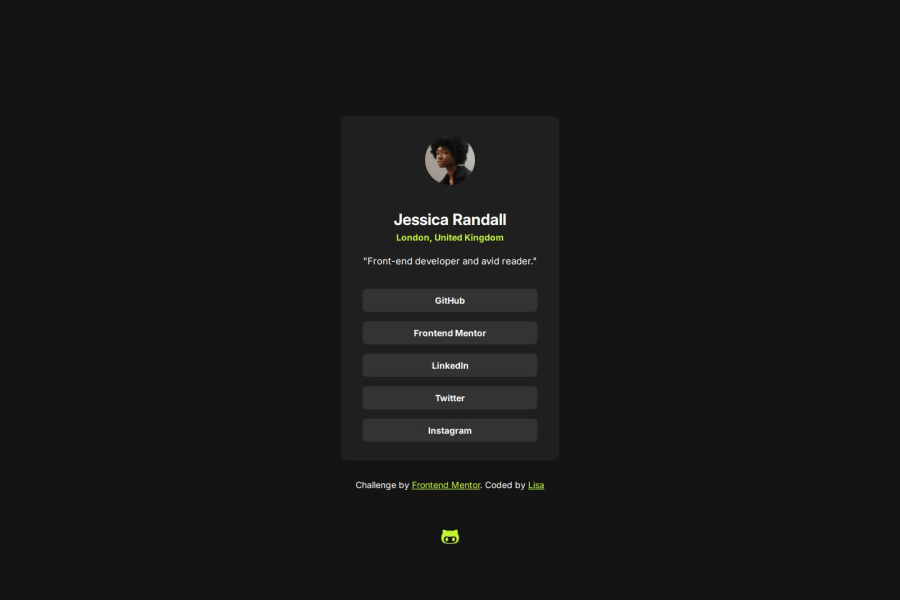
Design comparison
Solution retrospective
I am most proud of the fact that i added the hover state to the paragraphs.
What specific areas of your project would you like help with?Let me know if there is a better way to complete this challenge. All tips are welcome! :D
Community feedback
- P@kaamiikPosted 4 months ago
Hi, congrats on completing this challenge! I noticed a few points I'd like to mention. Before that, I suggest choosing challenges based on the Frontend Mentor learning path rather than selecting them randomly. It's better to start with basic challenges and then progress to junior, intermediate, and advanced levels.
- First of all, your Github link is broken or wrong. I can not see your code inside the Github.
- Try to use a proper CSS reset at the start of your CSS style. Andy Bell and Josh Comeau both have a good one. You can simply search on the internet to find them.
- Adding
paddingormargininside your body selector is not true I think and CSS on your body should contain more general CSS properties like font-size, min-height and ...
- Your
font-sizeandmax-widthshould be inremunit notpx. You can read this article about it and why you should not usepxas a font-size. Try to use moreremfor padding and margin too.
- Never limit your width and height in a container or element or tag that contains text inside.
When you limit the width and height of elements containing text, you risk the text being cut off,
overflowing, or becoming unreadable, especially on smaller screens or when the text dynamically changes.
It's generally better to allow the container to adjust its size based on its content or set a flexible
size that can adapt to different screen sizes and text lengths. You only need
max-widthhere because it prevents elements from stretching beyond a certain point, keeping them visually appealing across different screen sizes. It ensures your design remains adaptive and doesn't get too wide on larger screens.
- Only the
h1should be in the html and as I see theh2andh3should be aptag. The address and description are not headings.
- Elements that have hover effect are interactive.
So because you have hover effects for your
h1then It needs to beaorbutton. Now you have to choose betweenaandbutton. If the element take you to a new page It should be anatag and If do an action like submit a form or add to cart then It should be abutton. Here the social links are interactive and they should be anatag because They take you to a new page. and they are like a list of link items so you have to wrap them inside theulwithlifor each link.
Marked as helpful0
Please log in to post a comment
Log in with GitHubJoin our Discord community
Join thousands of Frontend Mentor community members taking the challenges, sharing resources, helping each other, and chatting about all things front-end!
Join our Discord
