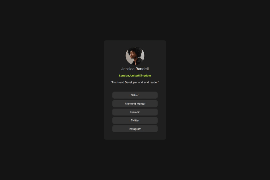
Design comparison
SolutionDesign
Solution retrospective
What are you most proud of, and what would you do differently next time?
I designed this without having a figma design to serve as a guide. I appreciate the importance of a figma design, i feel it helps with simplifying the design process.
What challenges did you encounter, and how did you overcome them?i still have issues with when to use the different display options.
Community feedback
Please log in to post a comment
Log in with GitHubJoin our Discord community
Join thousands of Frontend Mentor community members taking the challenges, sharing resources, helping each other, and chatting about all things front-end!
Join our Discord
