


@Stroudy
Posted
👋Hello again, Great job with this solution and wanting some feedback, This is what this community is about, A few things I noticed...
- I would put these into a
<ul> <li>because they are a list of social links and the text should be wrapped with a<a>like you have already done so it is accessible with a keyboard using the tab key,
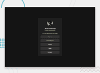
<a href="https://www.github.com/" class="button card_button">GitHub</a>
<a href="https://www.frontendmentor.io/" class="button card_button">Frontend Mentor</a>
<a href="https://www.linkedin.com/" class="button card_button">LinkedIn</a>
<a href="https://www.twitter.com/" class="button card_button">Twitter</a>
<a href="https://www.instagram.com/" class="button card_button">Instagram</a>

Something like this,

 <ul>
      <li><a>GitHub</a></li>
      <li><a>Frontend Mentor</a></li>
      <li><a>LinkedIn</a></li>
      <li><a>Twitter</a></li>
      <li><a>Instagram</a></li>
    </ul>
- Tho not a problem you could set the
widthandheightfor an<img>helps the page load faster and prevents content from jumping around as the image loads. This is good for performance and improves user experience. However, if your image needs to keep a consistent shape (aspect ratio) across different screen sizes, it's better to use the CSSaspect-ratioproperty instead.
<img src="assets/images/avatar-jessica.jpeg" alt="Jessica's profile image" class="card_image">
-
For
paddingandmargin, -
remIs best for consistency and scalability, -
%Best for responsive layouts, -
pxBest for fixed, precise spacing, -
Best practice is
remfor accessible layouts, In my opinion. -
For future project, You could downloading and host your own fonts using
@font-faceimproves website performance by reducing external requests, provides more control over font usage, ensures consistency across browsers, enhances offline availability, and avoids potential issues if third-party font services become unavailable. Place to get .woff2 fonts -
Add this code snippet to your body to center the vertically,
  min-height: 100svh;
  display: flex;
  justify-content: center;
  flex-direction: column;
  align-items: center;
min-height: 100svh;: Sets the minimum height to 100% of the small viewport height.display: flex;: Enables flexbox for flexible layout.justify-content: center;: Centers content vertically.flex-direction: column;: Stacks items vertically.align-items: center;: Centers content horizontally.
I hope you found a lot of this information helpful, I know it is a lot and it is not to say you have done anything wrong because you have not, In fact you have done very well and make so much progress already. Keep building on your knowledge, and remember, every step forward is progress. You’re on the right track, and you’re doing great. Have an awesome day and happy coding! 😊
Marked as helpful
@Stroudy
Posted
Also dont forget with BEM it is _ _ Double underscore card__title for example, BEM Cheat Sheet This helps me understand BEM a bit better might help you.
Marked as helpful
@justcallmezino
Posted
Thanks @Stroudy, I will update it. Thanks again
