

Design comparison

Solution retrospective
give your feedback, thank you
Community feedback
- @justinconnellPosted 9 months ago
Congrats on submitting this challenge!
Your solution looks great so I decided to give it a review and leave some feedback that I hope you will find useful.
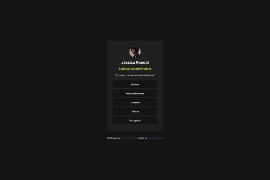
At a glance I noticed that you did not apply the colour specified for the link button - the background should be
#333, so I inspected the elements using developer tools in chrome and found that you would need to make some adjustments to the CSS to get the links styled as buttons. If you remove the padding from thelielement and set the attributes up on theaelement, you will be able to use the appropriate background.Looking at the live preview I noticed that you took a 'mobile first` approach to the design implementation - this is great!
I also noticed that the layout is the same for mobile and desktop screen sizes. Because you have the mobile layout sorted already you can use a media query to define a breakpoint to resize the layout for larger screens.
I then went on to reviewing your code and made the following observation:
- The HTML is readable and well structured
- The class names you used in the CSS are pretty good - they tell me what the markup is supposed to represent - the only one that's questionable is
job-descriptionit could possibly be something likebioorintro(duction)- over all you're good at naming and 'naming is hard!'
Overall, your code is pretty clean and easy to read - nicely done!
In terms of continued improvement, try using 'semantic HTML' to markup components. To be more pragmatic about the suggestion, if we consider that a card is an ‘article’ and that it has a ‘header’, ‘content’ and ‘footer’ section, then using more semantic markup will server a dual purpose:
- Make the HTML more readable for humans
- Make the HTML more readable to machines and provide context to machines that need to read the markup out to people who are visually impaired.
Semantic HTML that can be used for card markup may look like this:
<article>
  <header>
      /* heading content here */
  </header>
  <section>
      /* main content here */
  </section>
  <footer>
     /* footer content here */
  </footer>
</article>
Overall, great job on the solution!
I hope you find this useful, keep on coding!
Marked as helpful1@DarshanFEUIPosted 9 months ago@justinconnell thank you very much for your feedback, it will improve my coding skill 😄
1

Please log in to post a comment
Log in with GitHubJoin our Discord community
Join thousands of Frontend Mentor community members taking the challenges, sharing resources, helping each other, and chatting about all things front-end!
Join our Discord