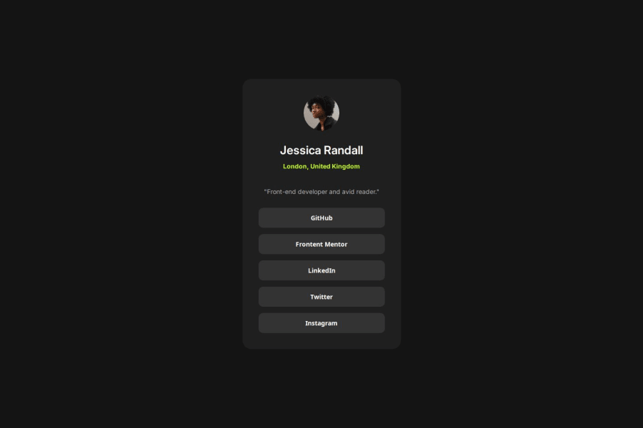
Design comparison
SolutionDesign
Solution retrospective
What are you most proud of, and what would you do differently next time?
I am most proud of how well it matches the actual, even without the Figma file to check spacing.
What challenges did you encounter, and how did you overcome them?I am unsure if the mobile size behaves the way the prompt expects, but I ensured it was responsive and the behavior made sense to the user.
What specific areas of your project would you like help with?General formatting, efficiency tips, and industry standards.
Community feedback
Please log in to post a comment
Log in with GitHubJoin our Discord community
Join thousands of Frontend Mentor community members taking the challenges, sharing resources, helping each other, and chatting about all things front-end!
Join our Discord
