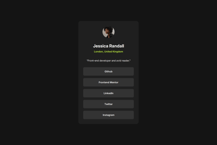


Design comparison
SolutionDesign

Please log in to post a comment
Log in with GitHubCommunity feedback
- @grace-snow
Hi there,
We done on your first draft of the challenge. This has a few issues so I'll try to go through them one by one.
- This contains some invalid html. What you have as a "h55" element should be a paragraph. It's definitely not heading content. Remember, headings are about structure and meaning, they are not about font size.
- Make sure you understand the different functionality (or purpose) of links (anchor elements) Vs. buttons. This design shows a list of links because they would clearly navigate somewhere.
- because it's clearly a list too, these should be in a list with list items in html. This whole process of looking at a design and translating the content into appropriate meaningful html is a really important foundational skill so make sure you pay attention to it in future (and any previous) challenges too.
- The footer should not be inside the main. They are independent landmarks.
- Use margin (or gap if using flex/grid) to create vertical space, don't add br elements into the html for that.
- get into the habit of including a full modern css reset at the start of the styles in every project. Andy Bell or Josh Comeau both have good ones you can look up and use.
- This solution is breaking when I view on mobile, especially in landscape orientation because you've limited the height of the body. That's making content overflow at the top of the screen where I can't reach it. Never limit the height of elements that contain text, including the body. Instead of height use min-height 100svh on the body to fix. This tells the browser the body can be taller than the viewport when it needs to be.
- Remove all of the height, width, min-height and min-width from the card. You don't need any of it and all that can do is cause problems. Instead, give the card a single max width in rem. Optionally it can have width 100% as well but nothing else to size it. That tells the browser it can only grow up to a certain width, but can shrink narrower when there isn't room available like on smaller screens. It's the browsers job to decide what height is needed based on the content, so you don't need to set anything on components like this for height.
- there's no benefit to using flex column properties inside this card unless you're using gap for the vertical spacing. It's not a problem, just that theres no real.benefit to doing it. Make sure you're only using properties you need.
- once you change the html you need to update some of the styles. This teaches why it's not recommended to use element selectors for anything except generic base styles at the start of a site and it's much better to use single class selectors for styling components.
Marked as helpful - @Edgerunners-2077
height and width could be better


Join our Discord community
Join thousands of Frontend Mentor community members taking the challenges, sharing resources, helping each other, and chatting about all things front-end!
Join our Discord