Design comparison
Solution retrospective
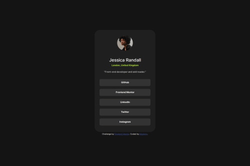
I had difficulty centering the text of the links, if you could give me feedback on other ways that I could have aligned I would appreciate it
Community feedback
- @jordancareyuiPosted 4 months ago
For centering,
text-align: center
gets the job done for me the majority of the time.Marked as helpful0 - @dirkvankriekenPosted 4 months ago
Nice job, your solution looks great and perfectly matches the design.
Some points about your code that I think might be improved: To my understanding one should use the next heading available so first you use h1 for the main heading, then you use h2 for the second smaller heading, after that h3, etc. I see you use h2, h5 and h6, and that might be because by default those headings font-sizing matches the design font the best. But I would suggest you use h1, h2, and h3. That is, as far as I know considered best practice. But furthermore, instead of using multiple headings element, I would use only h1 for the name (because that is the heading of the element) and something more like a <p> paragraph </p> for the "london, UK" subtext, because that is not really a heading and for the "front end developer and avid reader" text I would use something like a <span>. Or another <p> paragraph, and then give both paragraphs class names to target them separately through your CSS code.
It's always a good idea to update the README.md to something that you wrote yourself. You can use the README-template.md as a template. And then remember to delete the README-template.md file because it doesn't have to be part of the repository.
The .vscode folder with its contents also don't have to be part of the repository A line with .vscode could have been added to the .gitignore file so that you don't accidentally add it.
I think the way you centered the text of the links with
text-align: center;
applied to the main element is perfectly fine.Marked as helpful0 - @tiagocostarebeloPosted 4 months ago
@Lucknagh, Good job on your submission. It closely matches the challenge requirements. Well done!
Regarding your question about centering the links, you can use the following approach:
Apply text-align: center to the links parent container. Use width: 100% and display: block on all links to make them clickable and extend the full width of their parent container, giving them a button-like appearance and allowing them to be clickable even when not hovering the link text.
Additionally, I'd advise against using fixed width and height for elements, as this can make responsiveness more challenging. Instead, set the width of the card container to 100% and use max-width or min-width to control its growth and ensure it adapts well to different screen sizes.
Keep up the great work!
Marked as helpful0
Please log in to post a comment
Log in with GitHubJoin our Discord community
Join thousands of Frontend Mentor community members taking the challenges, sharing resources, helping each other, and chatting about all things front-end!
Join our Discord