

Design comparison

Please log in to post a comment
Log in with GitHubCommunity feedback
- @fayiz770
Hello there 👋. Congratulations on successfully completing the challenge! 🎉
Improvements
Accessibility
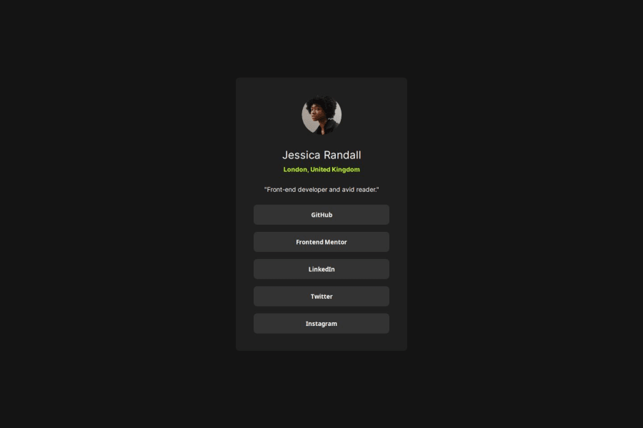
Consider adding aria-labels to buttons for better accessibility. This will provide screen readers with more context about what each button does.
Font Loading
Specify a font-display property for the Google Fonts to control their behavior during loading. For example:
font-display: swap;.Button Links
If the buttons are intended to link to social profiles, consider using anchor tags (<a>) styled as buttons instead of <button> elements. This is more semantic and improves accessibility.
Semantic Tags
Consider using <header> and <footer> tags if there are sections that can logically be wrapped with these tags. This would enhance the semantic structure further. Example of Accessible Button with Anchor Tag
HTML
<a href="https://github.com" class="social-button" aria-label="GitHub Profile">GitHub</a>CSS for Anchor Styled as Button
.social-button {
    display: block;
    width: 304px;
    height: 45px;
    background-color: var(--Grey);
    border: none;
    border-radius: 8px;
    color: var(--White);
    font-weight: 600;
    text-align: center;
    line-height: 45px; /* Align text vertically */
    text-decoration: none;
}

.social-button:hover {
    background-color: var(--Green);
    color: var(--Grey);
}
Final Thoughts
Your project is well-executed, with a good balance of aesthetics and functionality. The design is clean, modern, and user-friendly. Implementing the suggested improvements can further enhance accessibility and maintainability. Great work!
If you find this helpful please mark helpfull.
Marked as helpful

Join our Discord community
Join thousands of Frontend Mentor community members taking the challenges, sharing resources, helping each other, and chatting about all things front-end!
Join our Discord