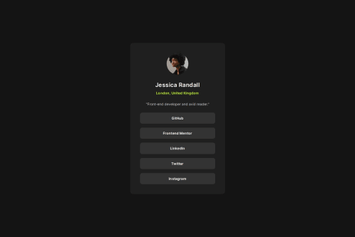
Submitted over 1 year agoA solution to the Social links profile challenge
Social Links Profile (HTML, SCSS)
sass/scss
@Redened

Solution retrospective
What are you most proud of, and what would you do differently next time?
...
What challenges did you encounter, and how did you overcome them?...
What specific areas of your project would you like help with?Clean code.
I am completely oblivious as to how this website generates screenshots for the comparison. nowhere in my workflow did the font look like that and yet in the screenshot its completely wrong.
If anyone can explain that would be much appreciated.
Code
Loading...
Please log in to post a comment
Log in with GitHubCommunity feedback
No feedback yet. Be the first to give feedback on Redened's solution.
Join our Discord community
Join thousands of Frontend Mentor community members taking the challenges, sharing resources, helping each other, and chatting about all things front-end!
Join our Discord