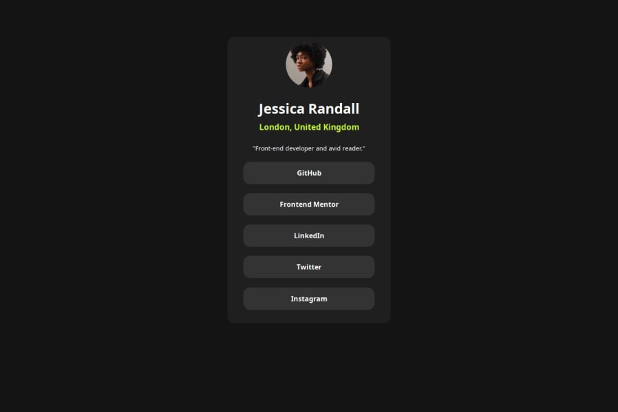
Design comparison
Solution retrospective
I'm proud that I tried more than once to get the same result as the provided design.
What challenges did you encounter, and how did you overcome them?I had a lot of issues with centering elements and containing them in their parent elements. I tried multiple ways, but I could've done better.
What specific areas of your project would you like help with?CSS centering and containing with flexbox and grid. I want to get comfortable using them and use the best solution a person can come up with. I need to learn more CSS!
Community feedback
- P@adhSwedePosted 6 months ago
Pros:
- Colors and fonts are correct
- Use of flexbox is great for this type of task.
Cons:
- Semantics in HTML kind of lacking (may i suggest ul>li for list type usage like the link list).
- Dimensions, Border radiuses, Fontsizes missmatch a bit.
Overall, GOOD JOB! If i could suggest something to work on, i would suggest you practice semantic HTML for SEO and screen readers to handle your work easier.
Marked as helpful0
Please log in to post a comment
Log in with GitHubJoin our Discord community
Join thousands of Frontend Mentor community members taking the challenges, sharing resources, helping each other, and chatting about all things front-end!
Join our Discord
