Submitted about 1 year ago
FAQ accordion - HTML, CSS, & Vanilla JavaScript
#accessibility
@darryncodes
Design comparison
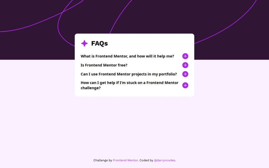
SolutionDesign
Solution retrospective
What are you most proud of, and what would you do differently next time?
Having completed the original FAQ challenge it felt only right to complete the updated version!
I tried to make this component as accessible as possible by:
- using semantic html and the most appropriate interactive elements
- styling the accordion with focus states to improve the experience for those who navigate the accordion using a keyboard
- utilising
aria-expanded,aria-hidden,aria-controlsattributes
Any accessibility specific feedback would be very welcome.
Community feedback
- @noelhoppePosted about 1 year ago
Hi, some suggestions:
- Remove
display: gridproperties frombody, main and footerand use
display: flex;
flex-direction: column;
justify-content: center;
align-items: center;
and remove
marginproperties frommainto center your FAQ container.Nice js!
0 - Remove
Please log in to post a comment
Log in with GitHubJoin our Discord community
Join thousands of Frontend Mentor community members taking the challenges, sharing resources, helping each other, and chatting about all things front-end!
Join our Discord
