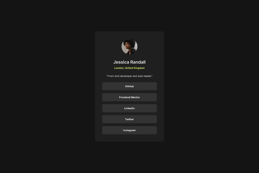


Design comparison

Solution retrospective
...made with a lot of love 🤘🏻🙂
Community feedback
- P@Mazhar1857Posted about 1 year ago
I'm facing an issue with the social-link-profile webpage, which I've noticed is also occurring on your page. When inspecting the live URL and setting responsive dimensions for mobile, such as choosing iPhone 12 Pro and rotating it into landscape mode, there are problems that occur when scrolling down, i have added some border for more visibility in my project. i will be very thank full if you help me out. i am using google chorme.
Marked as helpful1@CheospherePosted about 1 year agoHello @mazhar1857, thank you very much for your comment, you are absolutely right, there are problems when rotating the screen horizontally, but I have solved it, I established a fixed height for the container (main label in my case) and for the body, and I also added some top and bottom padding to the body to create some space in the landscape view.
1P@Mazhar1857Posted about 1 year agohello @Cheosphere, it just takes a small change like using min-height instead of height to resolve a layout issue. but it took 5 to 6 hours .
0 - @NantuePosted over 1 year ago
How do you know the perfect pixel of the cards?
5@CheospherePosted over 1 year agoHello @Nantue , I have some knowledge of graphic design, what I do is carefully examine the "desktop-design.jpg" file, using photoshop or illustrator, so I can measure the sizes, margins and padding of each element, and apply it to my development to achieve a result almost identical to the UI design that they give us in the project files folder. It's a bit stressful and time-consuming work, but I like seeing the end result.
17@NantuePosted over 1 year agohello @Cheosphere, Yes, the final result is very Good.
1@DiwanshumidhaPosted over 1 year agoBut padding and margins depend on the size of the screenshot how you get the size @Cheosphere
4@CheospherePosted about 1 year ago@CaioQuerino I don't have access to figma, because my account is free.
1@CaioQuerinoPosted about 1 year ago@Cheosphere I understood. Your design is great, I use figma to help me from time to time.
1@LipheleloPosted about 1 year ago@Cheosphere Your work is amazing bro....Man...i hope i get to be better just like you are in this filed of coding !!!! :)
1@Awal6392Posted about 1 year agoHi @Cheosphere , I want to learn more about the graphic design ( UI ) any YouTube channel you can recommend
1Account deleted@Cheosphere
Hello, I came across this comment after you liked one of my designs. I can see you love this work. I just figured out a good solution that should save you a lot of time, which I will start using as well. There is a chrome extension called "PixelParallel" which allows you to upload the design JPG files as overlays over the localhost browser window with some custom transparency. This way you can build on top of the transparency instead of painstakingly measuring in software.
1P@MukarramHaqPosted 12 months ago@Cheosphere We need a tutorial on how you do that, please
1 - @justinconnellPosted about 1 year ago
Pixel perfect!
I noticed that you use straight up CSS and that your code is well structured and readable - I also noticed that you use class selectors and element selectors in the CSS codebase - if you were working on a larger project would you use class selectors instead of element selectors?
The reason I ask is because I've been reducing the amount of base HTML I touch and opting for a more BEM type of approach to class names - my thought is that this eliminates problems with 'specificity' but has the downside of increasing the size of the CSS codebase.
I'm very interested in your take on this - thanks so much for your time.
2@CheospherePosted about 1 year agoHello @justinconnell thank you very much for your comment. I try to arrange the CSS code in the simplest way possible depending on the complexity of the project. In this case, for a small project, I applied CSS styles directly on the HTML tags, but when the project is larger and/or complex, I do so by establishing classes to avoid problems in the CSS code cascade. Systems like the one you mention (BEM) honestly I have not studied them in depth, it is a task that I have pending.
1@justinconnellPosted about 1 year ago@Cheosphere thank you for responding to my question - that makes sense to me.
1 - @hebaahmedsalehPosted about 1 year ago
it is pixel perfect, amaaazing but I have a question you are working with px for example the links has fixed height 45px ? but in real life work designers always request getting dynamic heights according to internal paddings and font-size. I think if we know the screen size of the implemented. it can be calculated not to be static height, what do you think ?
1@CheospherePosted about 1 year agoHello @hebaahmedsaleh, thank you very much for appreciating my work, regarding what you mention about using fixed or dynamic measurements, in this case I was simply guided by the design reference that they gave us in the project folder (desktop-design.jpg and mobile-design.jpg), and in both views the size of the links is the same, for that reason I decided to leave the height at 45 pixels.
0 - @matthewkuriaPosted over 1 year ago
Great implementation!
1 - @dashaunnPosted over 1 year ago
You're my inspiration 🤩 Beautiful work as usual @Cheosphere 👍🏾
1


Please log in to post a comment
Log in with GitHub
Join our Discord community
Join thousands of Frontend Mentor community members taking the challenges, sharing resources, helping each other, and chatting about all things front-end!
Join our Discord