Design comparison
Solution retrospective
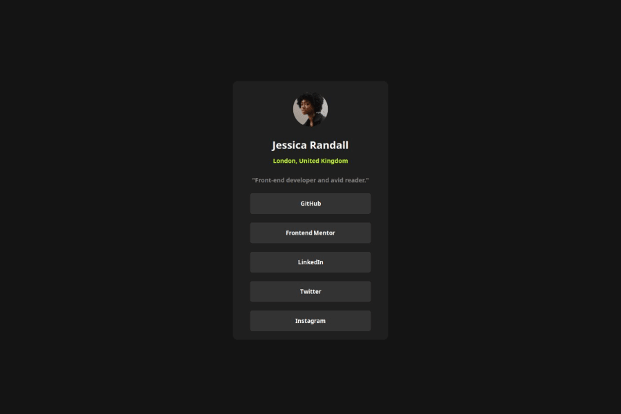
What I'm proud of: I'm proud of the clean and simple design I created for this project. I focused on providing a well-organized and visually appealing interface with the user experience in mind. Additionally, adding animations brought the site to life and enhanced interactivity. Seeing how these small details improved the overall look of the project makes me proud. Alhamdulillah 😊
What I would do differently next time: Next time, I would spend more time optimizing the project for mobile devices. Although the design is responsive, there is room to improve animations and layout for mobile users. I would also plan the project architecture more carefully from the beginning, which would simplify the code.
What challenges did you encounter, and how did you overcome them?I didn't face any difficulties, Alhamdulillah.
What specific areas of your project would you like help with?I would appreciate feedback on how to further optimize the responsiveness of my design for various screen sizes. Additionally, insights on improving code structure and best practices for organizing CSS and animations would be helpful. Any suggestions on enhancing user experience, particularly in terms of smooth interactions and performance, would also be valuable.
Community feedback
Please log in to post a comment
Log in with GitHubJoin our Discord community
Join thousands of Frontend Mentor community members taking the challenges, sharing resources, helping each other, and chatting about all things front-end!
Join our Discord
