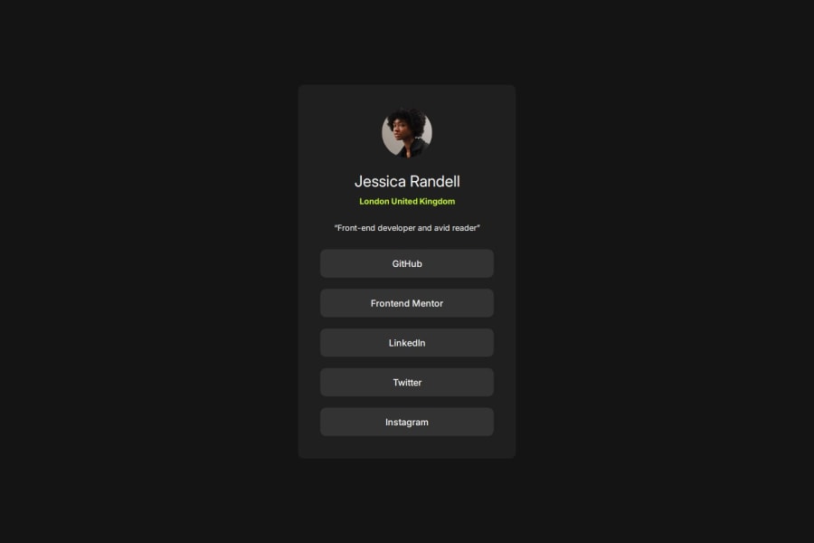
Design comparison
Solution retrospective
Been able to effectively use flex-box and pseudo classes. I'd add some animation to my hover state on future projects.
Community feedback
- @SvitlanaSuslenkovaPosted 3 months ago
@media screen and (max-width: 1440px) {... This, I opened it and didn't see half of your css, my screen is bigger... It's better to start from css for mobile screen and add @media for desktop (with min-width). Hope you found this comment helpful :)
Marked as helpful0 - @MikDra1Posted 3 months ago
I encourage you to use this technique to make the card responsive with ease:
.card { width: 90%; max-width: 600px; }
On the smaller screens card will be 90% of the parent (here body), but as soon as the card will be 600px it will lock with this size.
Also to put the card in the center I advise you to use this code snippet:
.container { display: grid; place-items: center; }
Hope you found this comment helpful πππ
Good job and keep going πππ
1 - @TedJenklerPosted 3 months ago
Hi @Dev-musty,
Nice project! I noticed that you're using <div> elements quite a lot. Consider incorporating more semantic HTML elements like <main> to improve accessibility and SEO.
Also, I see that youβre using <button> elements instead of <a> tags. Remember that <a> tags should be used for links, while <button> elements are meant for actions like submitting a form or triggering a function.
Additionally, itβs important to use your headings correctly. <h1>, <h2>, and so on should be used in a hierarchical order from most important to least important and then styled with CSS. Note that <h1> should only be used once per page.
Continue the great work!
Best, Teodor
0
Please log in to post a comment
Log in with GitHubJoin our Discord community
Join thousands of Frontend Mentor community members taking the challenges, sharing resources, helping each other, and chatting about all things front-end!
Join our Discord