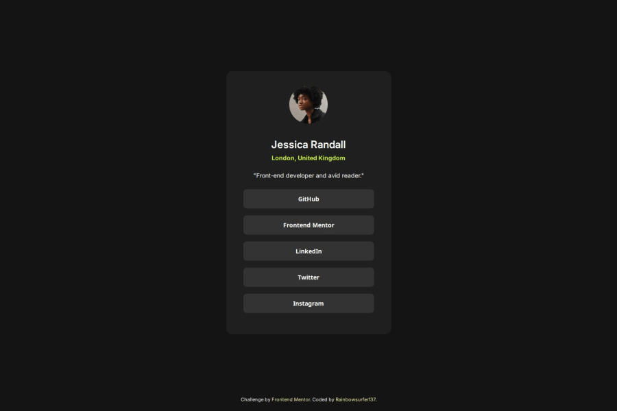


Design comparison

Solution retrospective
I’m proud of improving my understanding of media queries and how to make designs responsive for different screen sizes. I successfully implemented a mobile-friendly layout that adjusts seamlessly to smaller devices. Additionally, I focused on accessibility, adding features like descriptive alt text for images and ensuring keyboard navigability, which enhances the usability of the project for all users.
Next time, I’d like to explore more advanced responsive design techniques, such as using CSS clamp() or min()/max() functions for fluid scaling. I’d also aim to further enhance accessibility by incorporating ARIA roles and testing the site with screen readers to ensure a fully inclusive experience.
What challenges did you encounter, and how did you overcome them?One significant challenge was working with Flexbox and understanding how parent and child elements interact to achieve the desired layout. To overcome this, I referred to documentation and practiced using Flexbox properties like justify-content, align-items, and flex-grow. I also experimented with debugging tools in the browser to visualize the Flexbox structure, which helped me identify and fix alignment issues.
What specific areas of your project would you like help with?Any tips on how to be more efficient or best practices to use would be appreciated!
Community feedback
- @HenryyDevPosted about 2 months ago
The responsiveness is impeccable, however the body is not occupying the entire width of the screen so the card is not 100% centered on computer screens
Marked as helpful0

Please log in to post a comment
Log in with GitHub
Join our Discord community
Join thousands of Frontend Mentor community members taking the challenges, sharing resources, helping each other, and chatting about all things front-end!
Join our Discord