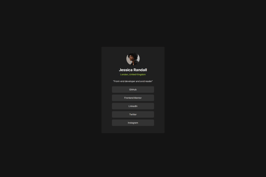
Design comparison
SolutionDesign
Solution retrospective
What are you most proud of, and what would you do differently next time?
I am proud that this project felt easier than the previous ones. It was mostly a consolidation of what I learned in the previous challenges. I guess hard work pays off.
What challenges did you encounter, and how did you overcome them?The main challenge was trying to "see" the project design as I tried to recreate it because of the dark background colors and no Figma files.
What specific areas of your project would you like help with?Any suggestions for improvements I will greatly appreciate.
Community feedback
Please log in to post a comment
Log in with GitHubJoin our Discord community
Join thousands of Frontend Mentor community members taking the challenges, sharing resources, helping each other, and chatting about all things front-end!
Join our Discord
