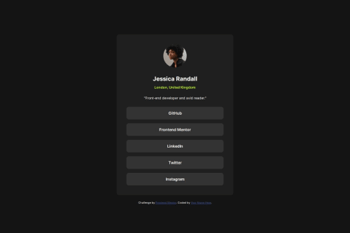
Submitted over 1 year agoA solution to the Social links profile challenge
Social links profile
@Donitron

Solution retrospective
What are you most proud of, and what would you do differently next time?
Proud of the amount of time it took to build this. Seems like I am getting comfortable with the basics and fundamentals of HTML & CSS.
What challenges did you encounter, and how did you overcome them?When shrinking the screen I couldn't keep some space between the card and the border of the screen. I fixed this by giving it a width of 89% but I am not entirely happy with that.
What specific areas of your project would you like help with?Another way of solving the challenge explained above?
Code
Loading...
Please log in to post a comment
Log in with GitHubCommunity feedback
No feedback yet. Be the first to give feedback on Donny's solution.
Join our Discord community
Join thousands of Frontend Mentor community members taking the challenges, sharing resources, helping each other, and chatting about all things front-end!
Join our Discord