

Design comparison
SolutionDesign

Community feedback
- P@monika-webdeveloperPosted 17 days ago
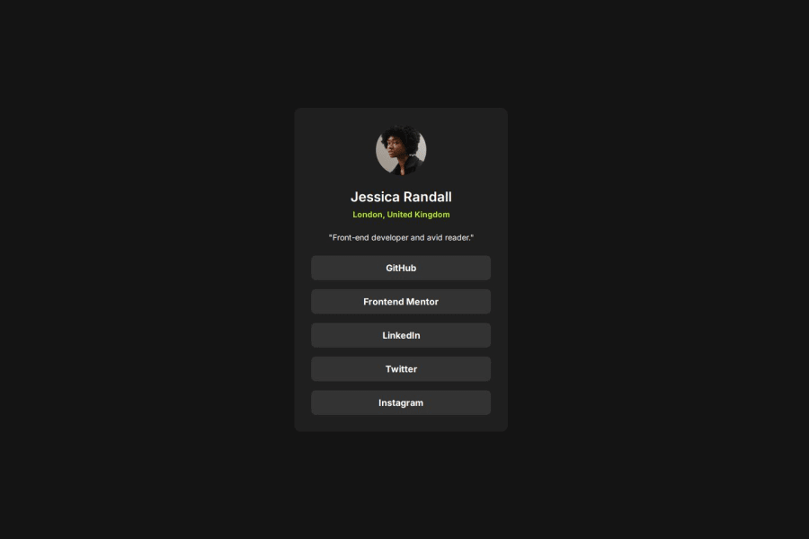
Good job! Your site looks really good. Your HTML code is clear and simple. I think there must be some small mistakes in your css code. There maight be something wrong with the padding. The card padding is 40px and yours a little bit different. But generally it looks pretty good.And the image size is 88px not 90px. Some minor changes and it will look perfect.
0 - P@dovlicioPosted 17 days ago
Hi, I like transition effect on hover, totally forgot about it for my solution :) One thing I see is that your design breaks for smaller screens (mobile), so you should work on it and fix it, for bigger screens you did a great job.
0


Please log in to post a comment
Log in with GitHubJoin our Discord community
Join thousands of Frontend Mentor community members taking the challenges, sharing resources, helping each other, and chatting about all things front-end!
Join our Discord