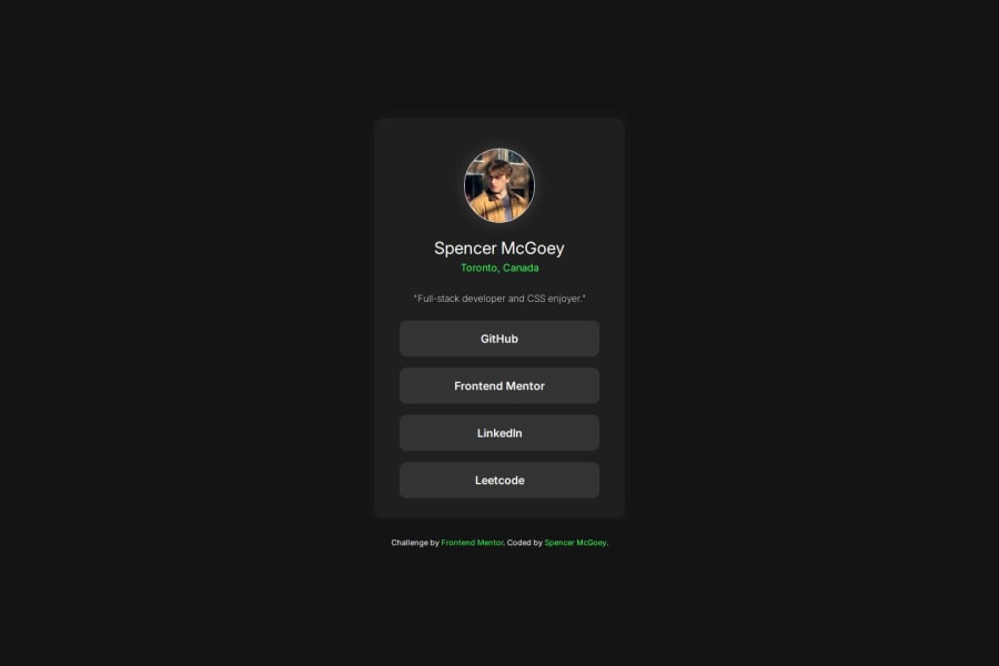


Design comparison

Solution retrospective
Proud of the tiny details I added to make it look more unique
What challenges did you encounter, and how did you overcome them?Problems with transitions and I overcame them by looking up tutorials and better understanding them with some research.
What specific areas of your project would you like help with?naming conventions with class names, anything people can find that I can improve on please let me know.
Community feedback
- P@makogeborisPosted 8 months ago
Nice work @Divinitry, here are a few things to review
- All content should be wrapped within landmarks. Wrap a
maintag around card. and afooterfor the attribution - Using an unordered list
ulto group the social media links is a better approach for both semantics and accessibility. - It's best practice linking Google fonts directly in the HTML
headsection rather than directly in your CSS file as it enables asynchronous downloading, improving page load times. - Consider using a modern CSS reset at the start of the styles in every project. Like this one Modern CSS Reset.
Marked as helpful2@DivinitryPosted 8 months ago@mkboris
oh wow, thank you very much for the feedback, will put these to good use!
1 - All content should be wrapped within landmarks. Wrap a
- P@MikDra1Posted 8 months ago
Nice one, @Spencer,
Here are some tips from me:
-
You should never make your body height 100vh. Instead you should try to make a container that will have this height.
-
If you have a font-family always try to add one additional font, like sans-serif, at the end, so if the browser doesn't understand the imported font, it will use the second one.
-
Next time, try to add a CSS reset to your code. If you don't know how to do it, here is a link for you -> POST and here is also a VIDEO
If you find this comment useful, please mark it as helpful 💗
Good job, and keep going 😀😁😉
Marked as helpful1@DivinitryPosted 8 months ago@MikDra1
Thank you so much for this!
Another comment here mentioned CSS reset so I will for sure look into this. Do you mind expanding on the first point? What are the drawbacks of making my body 100vh? and instead switching it to a container, what would that accomplish? just wanna learn more, thanks!
0P@MikDra1Posted 8 months ago@Divinitry
Sorry for that I wasn't clear. I meant if you want to you can use height one body, but instead of fixed height you should you min-height so if the content will overflow we will still see it.
😀😁😊
Marked as helpful0 -


Please log in to post a comment
Log in with GitHubJoin our Discord community
Join thousands of Frontend Mentor community members taking the challenges, sharing resources, helping each other, and chatting about all things front-end!
Join our Discord