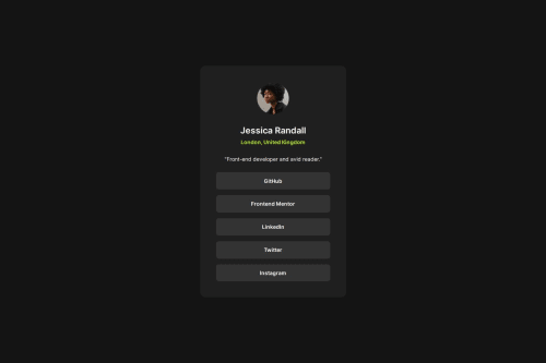
Social Links Profile

Solution retrospective
I was able to figure out a way to match the design more efficiently. I also figured out the use of media query.
What challenges did you encounter, and how did you overcome them?I really struggled with matching the design efficiently. I also struggled with media query. Also struggled with figuring out font weights from the design image. I also had to add margin-bottom for every button instead of just using gap because using flexbox decreased the button width.
What specific areas of your project would you like help with?Does using flexbox add some margin or padding within the container? Any feedback on how to make my code shorter would also be appreciated!
Please log in to post a comment
Log in with GitHubCommunity feedback
No feedback yet. Be the first to give feedback on vaguepizza's solution.
Join our Discord community
Join thousands of Frontend Mentor community members taking the challenges, sharing resources, helping each other, and chatting about all things front-end!
Join our Discord