Submitted almost 2 years agoA solution to the Social links profile challenge
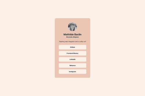
Social Links Profile designed for me my way
@matbac85

Solution retrospective
What are you most proud of, and what would you do differently next time?
Hello !
I'm pleased with the colours chosen and the way the result looks.
What challenges did you encounter, and how did you overcome them?The difficulty for me on this challenge was to properly organize this list of links by getting rid of the styles inherent to the , , and elements. Also, with my manipulations, I realize that I can't make the cursor appear when I hover over my links. I've tried cursor: pointer, but it's not working.
What specific areas of your project would you like help with?I'm open to any suggestions and advice.
Code
Loading...
Please log in to post a comment
Log in with GitHubCommunity feedback
No feedback yet. Be the first to give feedback on matbac85's solution.
Join our Discord community
Join thousands of Frontend Mentor community members taking the challenges, sharing resources, helping each other, and chatting about all things front-end!
Join our Discord