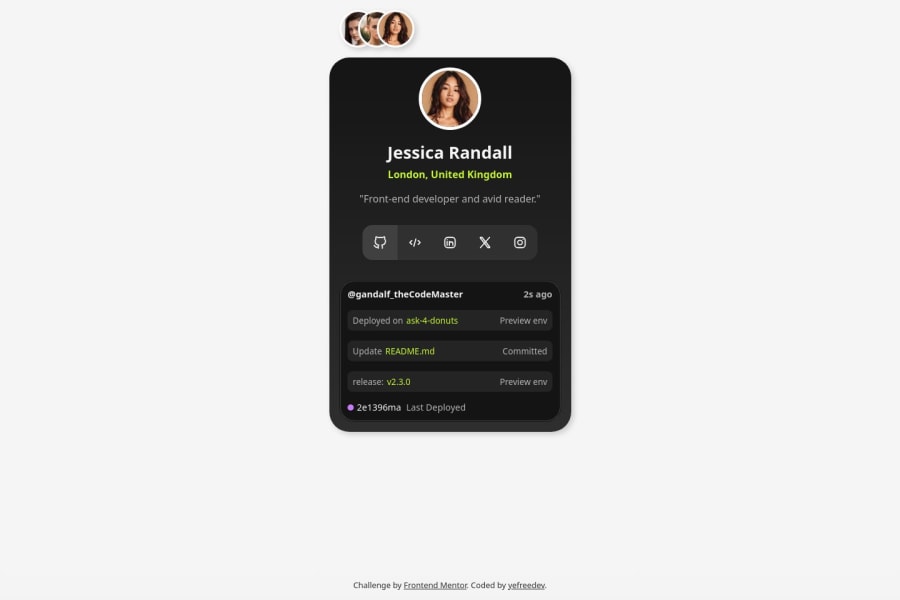
Design comparison
SolutionDesign
Solution retrospective
What challenges did you encounter, and how did you overcome them?
I aimed to give this “simple” challenge a new perspective, incorporating more interactivity and a modern approach. I’m really pleased with how the final result turned out.
- Making it interactive while ensuring good semantics for various users.
- Managing the different sizes and heights of the containers.
- Ensuring it is responsive and usable across different screen sizes and devices.
More details about the project could be found in my GitHub repository, link in the description.
Community feedback
Please log in to post a comment
Log in with GitHubJoin our Discord community
Join thousands of Frontend Mentor community members taking the challenges, sharing resources, helping each other, and chatting about all things front-end!
Join our Discord
