

Design comparison

Solution retrospective
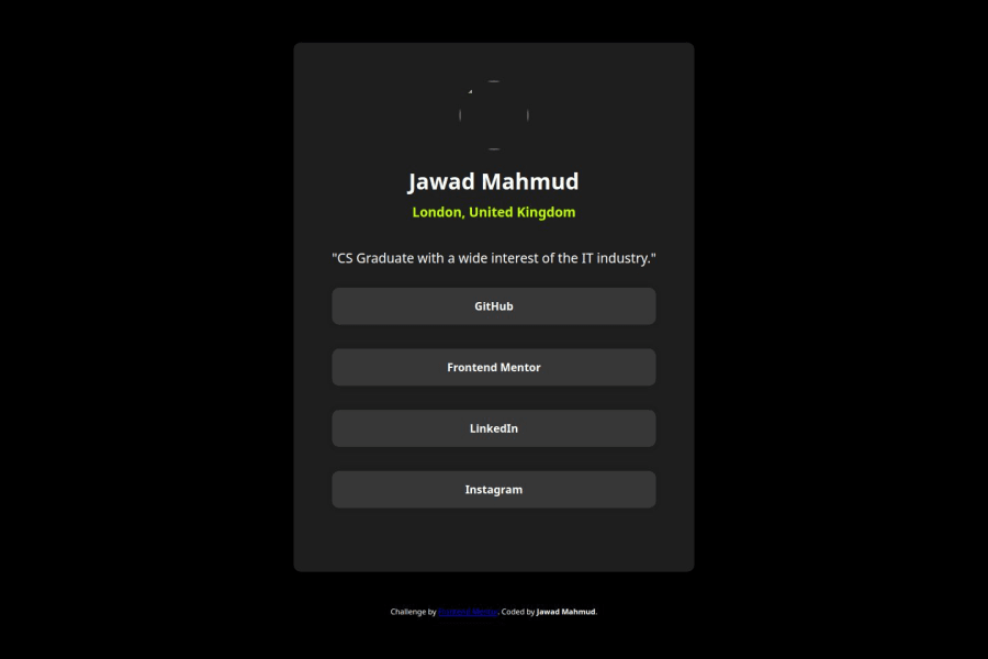
What I was proud to do was be able to customising a social link profile and that it would redirect the user to a site of the profile, particularly from GitHub. What I can do differently is possibly include some icons to the social link buttons to give it more clarity.
What challenges did you encounter, and how did you overcome them?The challenging parts that I have encountered throughout this challenge are trying to shape the profile box and that I have had difficulty in making the profile photo look more circular. I have been able to overcome this by adding a few more padding and border radius, as well as preventing the photo's overflow by keeping it hidden. Despite these challenges, I still enjoyed developing and customising the social links profile.
Community feedback
- P@MikDra1Posted 8 months ago
I encourage you to use this technique to make the card responsive with ease:
.card {
width: 90%;
max-width: 600px;
}
On the smaller screens card will be 90% of the parent (here body), but as soon as the card will be 600px it will lock with this size.
Also to put the card in the center I advise you to use this code snippet:
.container {
display: grid;
place-items: center;
}
Hope you found this comment helpful 💗💗💗
Good job and keep going 😁😊😉
Marked as helpful0@JawadM2002Posted 8 months ago@MikDra1 thank you so much, I'll make sure to follow this technique for future use 😊😁
0@grace-snowPosted 8 months ago@MikDra1 please use rem when you keep giving this piece of advice out. It makes a huge difference to those of us with a larger text size. I don't want to have to go through every challenge where you post this comment and add the note, it would be much easier if it said rem in the first place (please please please)
0 - @NatteeNPosted 8 months ago
Amazing work! You point to the right. Adding an icon for social will be make it more user friendly.
Marked as helpful0@JawadM2002Posted 8 months ago@NatteeN thanks so much, I did try to add the icon on the hosted app, but it did work on the live server on VS Code. At least it worked for the most part, ahah. But again, thank you so much for your great feedback. :)
0


Please log in to post a comment
Log in with GitHub
Join our Discord community
Join thousands of Frontend Mentor community members taking the challenges, sharing resources, helping each other, and chatting about all things front-end!
Join our Discord