

Design comparison

Solution retrospective
I'm most proud that I completed it in around 30 minutes, although next time I reckon I could do it in under. It would've been helpful if I had used emmet as that would've significantly cut down on the time taken to complete the semantics.
What challenges did you encounter, and how did you overcome them?I really struggled to get the links to take up the full space of the grid. In the end I added this
 display: grid;
 grid-auto-columns: 1fr;
To my .links section which helped expand it all
I also need to configure prettier as some of the code that it formatted is actually still quite ugly (I.E the links in the html)
What specific areas of your project would you like help with?I still really struggle with font's/font sizes. I can't get how to make them accurate. I also don't understand how to eyeball pixel size and when to use what unit, although I suspect the latter is just practice.
Community feedback
- P@StroudyPosted 7 months ago
Hello again, Fantastic effort on this! You’re really nailing it. Just a few things I noticed that could make it even better…
- I would put these into a
<ul> <li>, and the text should be wrapped with a<a>so it is accessible with a keyboard using the tab key, Using an<a>tag for navigation is semantically correct, improves accessibility for screen readers, and ensures consistent behavior across browsers, unlike a<button>or a<div>not intended for links.
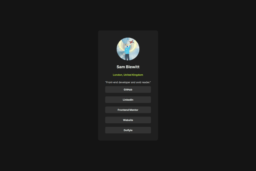
<section class="details"> <h1 class="name">Sam Blewitt</h1> <h2 class="location">London, United Kingdom</h2> </section> <p class="desc">"Front-end developer and avid reader."</p> <section class="links"> <a href="http://github.com/wotanut" class="link">GitHub</a ><a href="http://linkedin.com/in/sam-blewitt" class="link">LinkedIn</a ><a href="http://frontendmentor.io/profile/wotanut" class="link" >Frontend Mentor</a ><a href="http://sambot.dev" class="link">Website</a ><a href="http://dotfyle.com/wotanut/dotfiles-config.nvim" class="link" >Dotfyle</a > </section>-
Using
font-display: swapin your@font-facerule improves performance by showing fallback text until the custom font loads, preventing a blank screen (flash of invisible text). The downside is a brief flash when the font switches, but it’s usually better than waiting for text to appear. -
I think you can benefit from using a naming convention like BEM (Block, Element, Modifier) is beneficial because it makes your CSS more organized, readable, and easier to maintain. BEM helps you clearly understand the purpose of each class, avoid naming conflicts, and create reusable components, leading to a more scalable codebase. For more details BEM,
You’re doing fantastic! I hope these tips help you as you continue your coding journey. Stay curious and keep experimenting—every challenge is an opportunity to learn. Have fun, and keep coding with confidence! 🌟
0 - I would put these into a

Please log in to post a comment
Log in with GitHubJoin our Discord community
Join thousands of Frontend Mentor community members taking the challenges, sharing resources, helping each other, and chatting about all things front-end!
Join our Discord