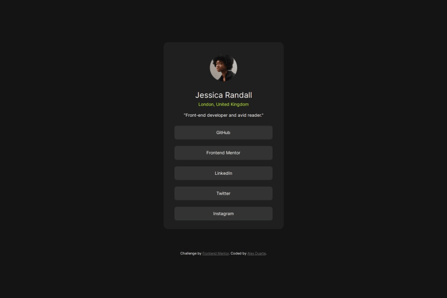
Design comparison
Solution retrospective
I am happy to have completed another challenge. As I progress I would add more interactivity to the buttons.
What challenges did you encounter, and how did you overcome them?Styling the buttons properly.
What specific areas of your project would you like help with?Sliming down the code
Community feedback
- @danielmrz-devPosted 7 months ago
Hello there!
Congrats on completing the challenge! ✅
Your solution looks great!
📌 It's recommended to use semantic HTML elements like
<ul>
and<li>
for creating lists. This ensures that your code is more accessible, maintainable, and semantically meaningful.Here's and example on how you can refactor your code:
After Refactoring
<ul class="list-container"> <li><a href="#">Github</a></li> <li><a href="#">Frontend Mentor</a></li> <li><a href="#">LinkedIn</a></li> ... </ul>
By using
<ul>
and<li>
, you convey the structure of your content more clearly, making it easier for screen readers and search engines to understand. Additionally, it aligns with best practices for HTML semantics.I hope you find this helpful!
Keep up the excellent work!
Marked as helpful0@adfrontenddevPosted 7 months ago@danielmrz-dev Thank you for taking the time to make a suggestion. I have made the appropriate changes.
0 - @0xabdulkhaliqPosted 7 months ago
Hello there 👋. Congratulations on successfully completing the challenge! 🎉
- I have a suggestion regarding your code that I believe will be of great interest to you.
MAKING ACCESSIBLE LINKS:
- The links like
Github
,Frontend Mentor
are needed to be actual<a>
elements which are wrapped up usingli
andul
elements. Thebutton
element is not appropriate to use in this solution. becausebutton
element can't be used for navigation purposes that's why we want to usea
elements.
- This is the current markup,
<button class="social_btn" type="button">GitHub</button> <button class="social_btn" type="button">Frontend Mentor</button> ....
- In order to make this solution accessible, we need to use
<a>
elements withhref
attribute. Here's the example
<ul> <li> <a href="#" class="social_btn">Github</a> </li> <li> <a href="#" class="social_btn">Frontend Mentor</a> </li> ... </ul> ....
- If you have any questions or need further clarification feel free to reach out to me.
.
I hope you find this helpful 😄 Above all, the solution you submitted is great !
Happy coding!
Marked as helpful0 - @sivaprasath2004Posted 7 months ago
Hello, I would like to extend my congratulations on completing this challenge.
- I will give suggestion i hope this is use your solution.
- You will use
height:100vh
this is not proper inmobile
site.
body{ height: 100vh; }
- If i will recommand for
min-height:100vh;
this is for proper use inmobile
site small size screen also can be proper work change the code to.
body{ min-height: 100vh; }
Marked as helpful0
Please log in to post a comment
Log in with GitHubJoin our Discord community
Join thousands of Frontend Mentor community members taking the challenges, sharing resources, helping each other, and chatting about all things front-end!
Join our Discord