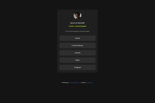
Social Links Profile Challenge

Solution retrospective
coded 95% without any help from a tutorial or anything.
What challenges did you encounter, and how did you overcome them?I had trouble styling buttons, so I had to watch a tutorial for it. Otherwise, I did everything myself and I am proud that I am starting to escape tutorial hell.
What specific areas of your project would you like help with?Understanding and adding media queries, I had problems with responsiveness on mobile screen at the end. I think I should have started with mobile first, but I did not know how. However, the end product was good for desktop screens, so I left it as is. I would like help about understanding media queries and how to implement them to make mobile responsive sites.
Please log in to post a comment
Log in with GitHubCommunity feedback
No feedback yet. Be the first to give feedback on TalalTahir01's solution.
Join our Discord community
Join thousands of Frontend Mentor community members taking the challenges, sharing resources, helping each other, and chatting about all things front-end!
Join our Discord