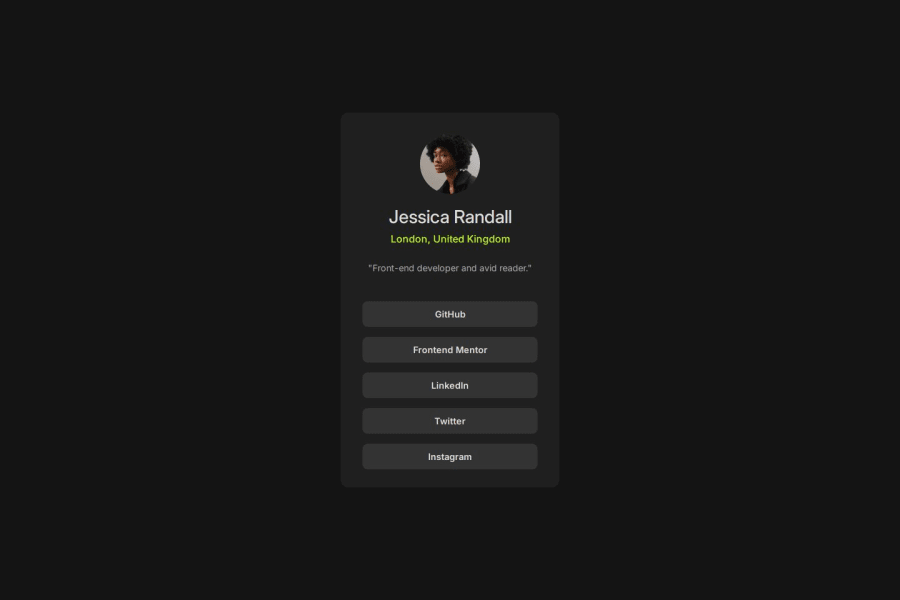


Design comparison

Solution retrospective
I'm proud of the transition I added to the hover state, that's a new thing I learned that's really cool.
What challenges did you encounter, and how did you overcome them?I tried taking a "Mobile First" approach on this one, it was much harder, I ended up redoing the whole CSS because it became pretty messy. I think the problem was dividing the container into 2 different sections, it messed up the natural flow of the document and setting margins between the two sections for responsive situations was very hard. I did take it a step further which I didn't do before and added a media query for screens in landscape mode which is a nice addition. For media queries, I found that copying a certain selector with all of it's settings to the media query - then deleting the irrelevant ones and modifying the relevant ones was easier, at least for now.
What specific areas of your project would you like help with?I think my solution is pretty responsive but I still couldn't get specific things to look exactly the way I wanted, I could have probably add much more settings to the media queries but that would've been too much work. Let me know what you think and what I could've done better, thanks!
Community feedback
- @osibsPosted 3 months ago
Your Code looks good. I saw you attached proper hyperlinks to the code. Brilliant and profession, I should have thought of that. Clean code too, More tags would have looked better imo though, For example, If you used either header and paragraph tags for the location & interest. Media query is also nice, Its good taking the step further even if it is a basic project.
0

Please log in to post a comment
Log in with GitHub
Join our Discord community
Join thousands of Frontend Mentor community members taking the challenges, sharing resources, helping each other, and chatting about all things front-end!
Join our Discord