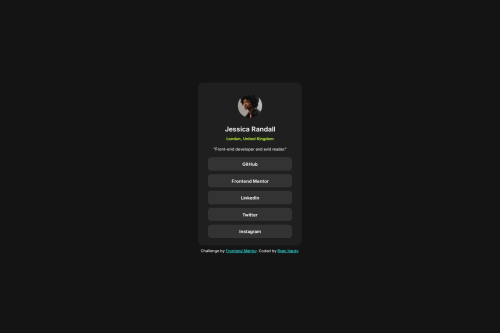
Social links profile card with the figure element and some flexbox

Solution retrospective
I am proud of how close I got to the design guide and the process I used to get there. I felt like I was a lot quicker at setting up the HTML and that allowed me to focus on the CSS as early as possible. I think I am starting to get the hang of these small "card" challenges.
What challenges did you encounter, and how did you overcome them?I was debating whether to use a list or plain flexbox for the social links. I found that the flexbox way was easier to style this time around. Towards the end I noticed that I didn't have as much space at the bottom of the card as the images, so I had to increase the height of the card to get it to match. I had to use a lot of random values for spacing the text properly like 0.3em or 0.7rem. I don't want to get in the habit of hacking it together with random values, if I can help it.
What specific areas of your project would you like help with?I am starting to notice how useful CSS variables can be. I know it doesn't apply as much in smaller challenges, but I want to learn how CSS variables are named/organized in larger projects to make things more consistent. Like usual, I could always use feedback on how the HTML as structured and if I did anything messy or unnecessary in the CSS.
Please log in to post a comment
Log in with GitHubCommunity feedback
No feedback yet. Be the first to give feedback on Ryan Hardy's solution.
Join our Discord community
Join thousands of Frontend Mentor community members taking the challenges, sharing resources, helping each other, and chatting about all things front-end!
Join our Discord