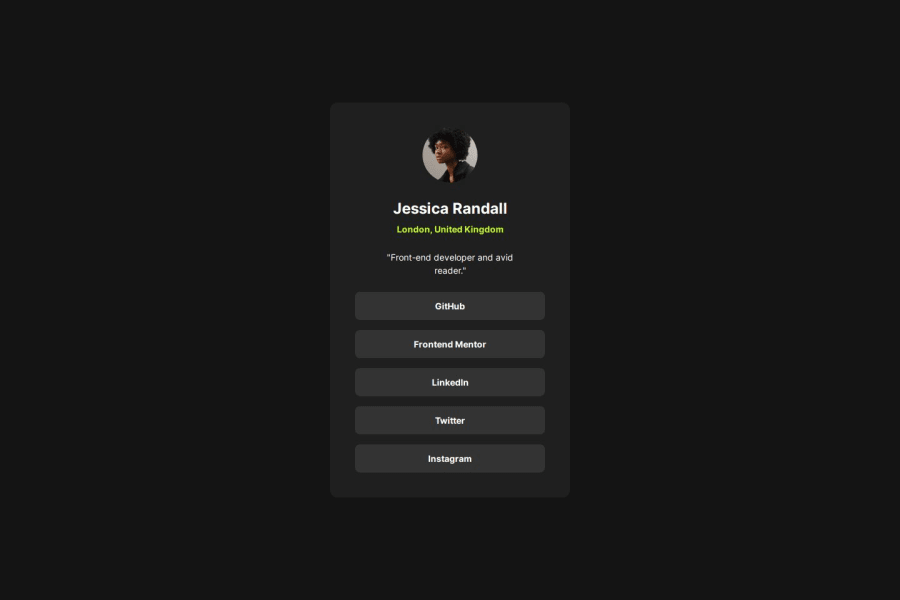
Design comparison
SolutionDesign
Solution retrospective
What challenges did you encounter, and how did you overcome them?
- tab navigation and :focus selector
- responsive text with clamp() function
- using transition on links
- I'm thinking what element should be the best to quotation.
- The links open in a new tab I do not know if it is right for this card.
- Perfect positioning both the card and the footer on different devices.
Community feedback
Please log in to post a comment
Log in with GitHubJoin our Discord community
Join thousands of Frontend Mentor community members taking the challenges, sharing resources, helping each other, and chatting about all things front-end!
Join our Discord
