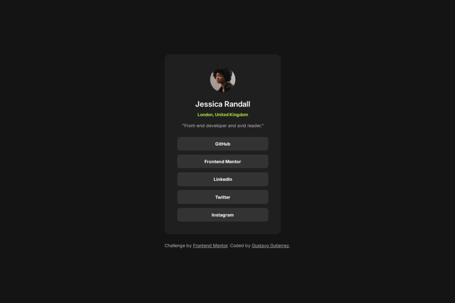
Social links profile card using HTML and CSS
Design comparison
Solution retrospective
I'm proud to say that I managed to build this project fairly quickly in comparison to the previous two challenges, especially considering that this time I didn't use the Figma design. From the structure of the HTML to the styling using CSS, everything went quite smoothly.
What challenges did you encounter, and how did you overcome them?There wasn't any particular challenge, except making the elements clickable. I had to make the elements occupy the same space as the list items to solve that problem.
Feedback on any improvements I can make whether is in the HTML structure or the way I styled the elements is more than welcome. Any feedback on accessibility improvements or things I am missing currently would be useful as well.
Community feedback
- @salva-itPosted 7 months ago
Your code is well written and well structured. I suggested that the <footer> tag should be placed inside the <main> tag in your code. The closing <footer> and <main> tags seem to be misplaced In general, your codes are very good, congratulations
Marked as helpful0@gustavo2023Posted 7 months agoHi @salva-it, thanks for taking the time to review my project. I hadn't notice that mistake on the footer. I have now fixed.
Thanks!
0
Please log in to post a comment
Log in with GitHubJoin our Discord community
Join thousands of Frontend Mentor community members taking the challenges, sharing resources, helping each other, and chatting about all things front-end!
Join our Discord
