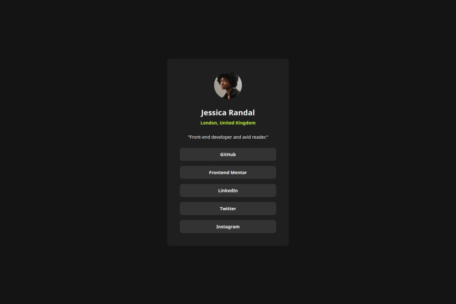
Social Links Profile Card using Flexbox


Design comparison

Solution retrospective
I mostly reuse some concepts I learned from previous project.
What challenges did you encounter, and how did you overcome them?I am struggling a bit on better fluidity between screen sizes. I might change some code along the way though as I learn more about responsive design and accessibility.
Community feedback
- P@psegarelPosted 28 days ago
It seems the containing elements for the list of buttons could do with a small padding. Personally, I've used 8px for horizontal padding.
Also your main container seems a bit too wide.
Hope it helps!
Marked as helpful1P@dev-ethanjohnPosted 27 days ago@psegarel Thanks! I recently updated my code. I refactored a lot, transition from flex to grid for the card. My issue with responsiveness for all 3 cases based off from the is now fixed by allowing the children to stretch while respecting the max-width of the card when on desktop. Also, I took your advise for uniform padding to all sides so that for smaller screens, the button may still have a bit of space horizontally. Regarding my main, I don't much think about it for now other than for semantic meaning. But, I am open for further suggestions or maybe some improvements. Thanks!
1P@psegarelPosted 27 days ago@dev-ethanjohn Looks much better, you may want to check the vertical padding of the buttons. Seems you're nearly there
0

Please log in to post a comment
Log in with GitHubJoin our Discord community
Join thousands of Frontend Mentor community members taking the challenges, sharing resources, helping each other, and chatting about all things front-end!
Join our Discord