


M Asim Saeed• 70
@asimsaeed353
Posted
I have updated the code. Please review it and let me know if there are still some changes to be done. Thanks
0
What specific areas of your project would you like help with?
I start building with Desktop First approach. So, I need help with responsiveness.
@asimsaeed353
Posted
I have updated the code. Please review it and let me know if there are still some changes to be done. Thanks
@asimsaeed353
Posted
Thanks A lot for this helpful suggestion. I will surely incorporate these changes in my code.
@Stroudy
Posted
Amazing job with this! You’re making fantastic progress. Here are some small tweaks that might take your solution to the next level…
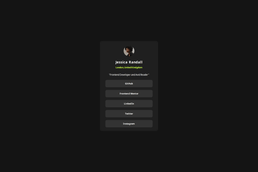
Avoid using id selectors for styling in CSS because they are too specific and hard to override, making your styles less flexible and maintainable. Instead, use class selectors (.), which are reusable and more manageable, allowing for better control over your styles and easier updates.
Your heading elements <h3><h5> Missing <h4>, Heading elements should be in sequentially-descending order (e.g., <h1>, <h2>, <h3>) to create a clear content structure, improving accessibility and SEO. Skipping levels or using them out of order can confuse screen readers, affect search engine rankings, and make your content harder to understand.
        <h3>Jessica Randall</h3>
        <h5>London, United Kindgdom</h5>
<ul> <li>, and the text should be wrapped with a <a> so it is accessible with a keyboard using the tab key, Using an <a> tag for navigation is semantically correct, improves accessibility for screen readers, and ensures consistent behavior across browsers, unlike a <button> or a <div> not intended for links. <div class="links">
<div class="link"><p>GitHub</p></div>
<div class="link"><p>Frontend Mentor</p></div>
<div class="link"><p>LinkedIn</p></div>
<div class="link"><p>Twitter</p></div>
<div class="link"><p>Instagram</p></div>
</div>
Having a clear and descriptive alt text for images is important because it helps people who use screen readers understand the content, making your site more accessible. It also improves SEO, as search engines use alt text to understand the image's context, helping your site rank better, Check this out Write helpful Alt Text to describe images,
Using rem or em units in @media queries is better than px because they are relative units that adapt to user settings, like their preferred font size. This makes your design more responsive and accessible, ensuring it looks good on different devices and respects user preferences.
You’re doing fantastic! I hope these tips help you as you continue your coding journey. Stay curious and keep experimenting—every challenge is an opportunity to learn. Have fun, and keep coding with confidence! 🌟
Join thousands of Frontend Mentor community members taking the challenges, sharing resources, helping each other, and chatting about all things front-end!
Join our Discord
