Design comparison
Community feedback
- P@Islandstone89Posted 5 months ago
HTML:
-
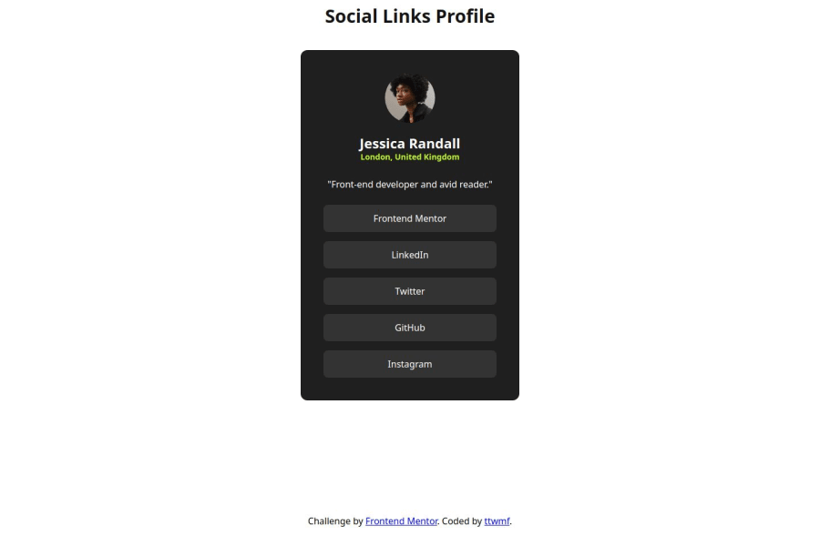
A better alt text for the image would be "Headshot of Jessica Randall".
-
"Jessica Randall" is a heading. I would make it a
<h2>- a page should only have one<h1>, reserved for the main heading. As this is a card heading, it would likely not be the main heading on a page with several components. -
Since these are social links, you must use the
<a>tag:<li class="button"><a href="/">GitHub</a></li>. The/refers to the current page, you can of course link to your profiles too. -
Wrap footer text in a
<p>.
CSS:
-
Including a full CSS Reset at the top is good practice.
-
On the
body, changeheighttomin-height: 100svh- this way, the content will not get cut off if it grows beneath the viewport. -
You're missing a comma on the font declaration:
font-family: 'Inter' sans-serif;should befont-family: 'Inter', sans-serif;. -
You should change the color of the text outside the card, as it has poor contrast. You could switch it to white, for example.
-
To make rounded images, we usually use
border-radius: 50%. -
Instead of:
.button:not(:last-child) {
    margin: 0.5rem 0;
}
You can create the space between the links using Flexbox on their parent:
.links {
    display: flex;
    flex-direction: column;
    gap: 0.5rem;
}
The benefit of using Flexbox is that you only get a gap between the elements, not at the end, so you don't need any
:not(:last-child)selector.-
Replace the
min-widthon.linkswithwidth: 100%. -
Add some
margin-bottomon the card, so it doesn't get squeezed against the footer.
Marked as helpful1P@ttwmfPosted 5 months ago@Islandstone89, thank you!
- Alt text should include a brief, meaningful description or be left empty if decorative.
- Use semantic tags whenever possible. Since "Jessica Randall" is a heading, I should use the <h2> tag for it and reserve <h1> for the page title. Will keep this in mind!
- Make links more accessible by using the <a> tag when wrapping link items.
- Avoid placing text directly inside a <div>. Thanks! 😊
- I now understand the difference between
min-heightandheight, as well assvhandvh. - I learned that the second font listed is a fallback in case the browser can't load the primary font.
- Thanks for the flexbox tips! I’ll keep practicing it more.
1 -
- P@leonardoalmeida7Posted 5 months ago
the code is semantic and clean, but the elements don't seem well positioned, details like width, font and alignment would need a little more attention.
0
Please log in to post a comment
Log in with GitHubJoin our Discord community
Join thousands of Frontend Mentor community members taking the challenges, sharing resources, helping each other, and chatting about all things front-end!
Join our Discord
