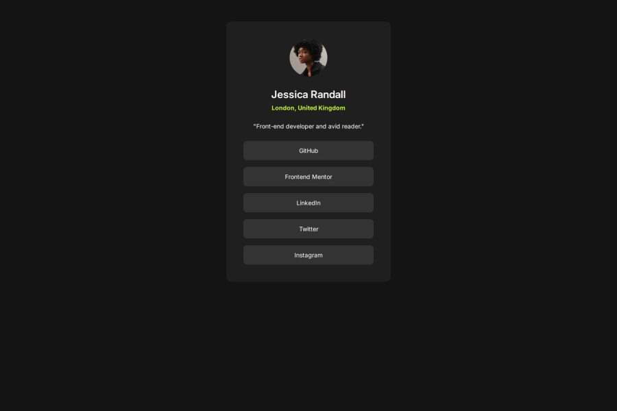
Design comparison
SolutionDesign
Solution retrospective
What are you most proud of, and what would you do differently next time?
I used relative units like percentage and rems.
Community feedback
- @isibellsiaPosted 5 months ago
It looks really good. You should only center the card in the page(body).
0P@katya-dPosted 5 months ago@isibellsia I know, but to I get rid the vertical scroll with writing just 5rem margin on the top. To looks good also on mobile screen without @media queries.
1
Please log in to post a comment
Log in with GitHubJoin our Discord community
Join thousands of Frontend Mentor community members taking the challenges, sharing resources, helping each other, and chatting about all things front-end!
Join our Discord
