Design comparison
Community feedback
- P@StroudyPosted 6 months ago
Exceptional work! You’re showing great skill here. I’ve got a couple of minor suggestions that could make this stand out even more…
-
Instead of using
<container class="main">use a semantic tag<main>inside the<body>of your HTML is a best practice because it clearly identifies the main content of your page. This helps with accessibility and improves how search engines understand your content. -
I would put these into a
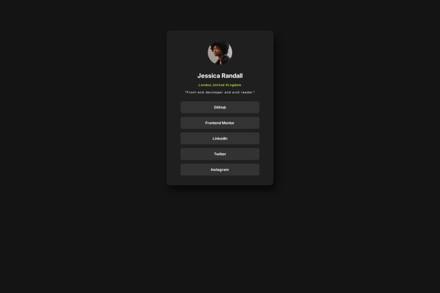
<ul> <li>, and the text should be wrapped with a<a>so it is accessible with a keyboard using the tab key, Using an<a>tag for navigation is semantically correct, improves accessibility for screen readers, and ensures consistent behavior across browsers, unlike a<button>or a<div>not intended for links.
<button class="btn">GitHub</button> <button class="btn">Frontend Mentor</button> <button class="btn">LinkedIn</button> <button class="btn">Twitter</button> <button class="btn">Instagram</button>-
Setting
font-size: 62.5%can affect accessibility by reducing the default browser font size, potentially making text harder to read for users with visual impairments. This does make it easier to work out the relative units but at what cost? -
Using a full modern CSS reset is beneficial because it removes default browser styling, creating a consistent starting point for your design across all browsers. It helps avoid unexpected layout issues and makes your styles more predictable, ensuring a uniform appearance on different devices and platforms, check out this site for a Full modern reset
I hope you’re finding this guidance useful! Keep refining your skills and tackling new challenges with confidence. You’re making great progress—stay motivated and keep coding with enthusiasm! 💻
Marked as helpful1 -
- @MrLanterPosted 6 months ago
Hi, I hope you are doing well. This is a great project.
The CSS seems correct to me, but it is mainly for the HTML that I suggest improvements:
Correct tags: the
containertag does not exist in HTML. It is therefore important to use recognized tags, for better readability, maintenance and SEO. You can use a semantic tag such asmain, orarticleinstead.Text font imports: you import the font from the HTML, which is acceptable. But since there is an assets folder with a fonts subfolder that contains the project's fonts, I advise you to use them. Just to get into good habits.
HTML organization: It is important to group important sections in the HTML in
sectionordivtags (or other tags). For example: create adivtag that contains Jessica Randall's profile and then another one for the links to her profiles.I hope this all helped you, have a nice day!
Marked as helpful0@Ghaithsy418Posted 6 months agoThanks a lot that was really helpful to me❤️❤️@MrLanter
0 - @Ghaithsy418Posted 6 months ago
Thx a lot for your comment i really appreciate that, I got all what did you say and I am gonna fix all that for sure. #Talking about font-size=62.5% => I got this trick from (Jonas Shmedtamnn) you may know him well for building an easy responsive design and to make it easy for you using REM unit when it becomes equal to (10px) instead of (16px)
1P@StroudyPosted 6 months agoHey @Ghaithsy418, Yeah I know who he is I am following his JavaScript course on Udemy, I would not go and change the font size like that personally, You can use a px to rem converter to figure it out and put them into variables, Easy and saves any complication that may arise. It may also interfere with accessibility tools and cause inconsistencies across devices if not handled carefully.
Marked as helpful1@Ghaithsy418Posted 6 months agoOh that was a good explain bro thanks a lot for I am trying devoloping my skills step by step inshallah @Stroudy
1P@StroudyPosted 6 months agoHey @Ghaithsy418, Its not a race, I am still learning too, You got this bro, You did a really good job, Just some minor feedback! 💪
Marked as helpful0@Ghaithsy418Posted 6 months agoYeah That's right I really enjoy this kind of feedback. Thanks a lot man and good luck with your learning path❤️❤️❤️❤️@Stroudy
1P@StroudyPosted 6 months agoHey @Ghaithsy418, I will keep and eye out for your next solution! 💪 No rush, Take your time 💻
Marked as helpful1
Please log in to post a comment
Log in with GitHubJoin our Discord community
Join thousands of Frontend Mentor community members taking the challenges, sharing resources, helping each other, and chatting about all things front-end!
Join our Discord
