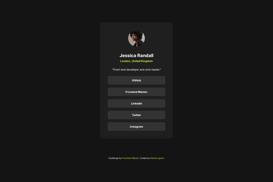
Not Found
Not Found
Not Found
Not Found
Not Found
Not Found
Not Found
Not Found
Not Found
Not Found
Not Found
Not Found
Not Found
Not Found
Not Found
Not Found
Not Found
Not Found
Not Found
Not Found

Submitted

Social Links Profile built with HTML and CSS

P
Daniel 70

@DAJ350

Desktop design screenshot for the Social links profile coding challenge

This is a solution for...

  • HTML
  • CSS
1newbie
View challenge

Design comparison


SolutionDesign

Solution retrospective


What are you most proud of, and what would you do differently next time?

I'm proud of how closely I was able to recreate the design using based of the provided Figma design file.

What challenges did you encounter, and how did you overcome them?

I had a slight challenge figuring out how to achieve the tablet and mobile dimensions but was able to overcome this using a couple media queries.

What specific areas of your project would you like help with?

I'm open to suggestions.

Community feedback

MikDra1 6,600

@MikDra1

Posted

Well done, here are some things to review 😊:

  • REM for Units: It's best to use rem for all units instead of px, as this ensures scalability and consistency in spacing and font sizes based on the user's root font size. It helps improve accessibility.

  • CSS Variables: Implement CSS variables (--primary-color, --font-size, etc.) for consistent values across the stylesheet. This will allow for easier theme management and tweaking.

  • BEM/Convention for Class Naming: Apply a class naming convention like BEM (Block Element Modifier) to make the styles modular and more maintainable. For example, use .card__title or .card--highlighted.

  • CSS Reset: Consider adding a full modern CSS reset (like normalize.css or custom resets at the beginning of the stylesheet) to ensure consistent styling across different browsers. Here is a link to one I really like.

  • Clamp() for Responsiveness: Use the clamp() function for fluid typography and spacing, allowing elements to resize smoothly between a minimum and maximum value based on the viewport size (e.g., font-size: clamp(1rem, 2vw, 1.5rem)).

  • Responsive Card: To make the card responsive, ensure the layout uses flex or grid combined with max-width instead of fixed width values. This will make the design more flexible and adapt better to different screen sizes.

  • Use max-width/min-width and max-height/min-height: Instead of using fixed width and height, opt for max-width or min-width to allow the elements to resize smoothly on different screen sizes, improving overall responsiveness.

Hope you found this comment helpful 💗💗💗

Good job and keep going 😁😊😉

Marked as helpful

1
P
Steven Stroud 5,000

@Stroudy

Posted

Awesome job tackling this challenge! You’re doing amazing, and I wanted to share a couple of suggestions that might help refine your approach…

  • You should put your variables into a :root { } so they can be accessed globally.

  • For future project, You could downloading and host your own fonts using @font-face improves website performance by reducing external requests, provides more control over font usage, ensures consistency across browsers, enhances offline availability, and avoids potential issues if third-party font services become unavailable. Place to get .woff2 fonts

  • Using rem or em units in @media queries is better than px because they are relative units that adapt to user settings, like their preferred font size. This makes your design more responsive and accessible, ensuring it looks good on different devices and respects user preferences.

  • Line height is usually unitless to scale proportionally with the font size, keeping text readable across different devices. Best practice is to use a unitless value like 1.5 for flexibility. Avoid using fixed units like px or %, as they don't adapt well to changes in font size or layout.

You’re doing fantastic! I hope these tips help you as you continue your coding journey. Stay curious and keep experimenting—every challenge is an opportunity to learn. Have fun, and keep coding with confidence! 🌟

Marked as helpful

1

@TheTrueScout

Posted

Someone suggested this to me, and I think it'll help you too :) it'll make your card more responsive.

.card {
width: 90%;
max-width: 37.5rem;
}
0

Please log in to post a comment

Log in with GitHub
Discord logo

Join our Discord community

Join thousands of Frontend Mentor community members taking the challenges, sharing resources, helping each other, and chatting about all things front-end!

Join our Discord