Design comparison
SolutionDesign
Community feedback
- @EdgarMadridPosted 5 months ago
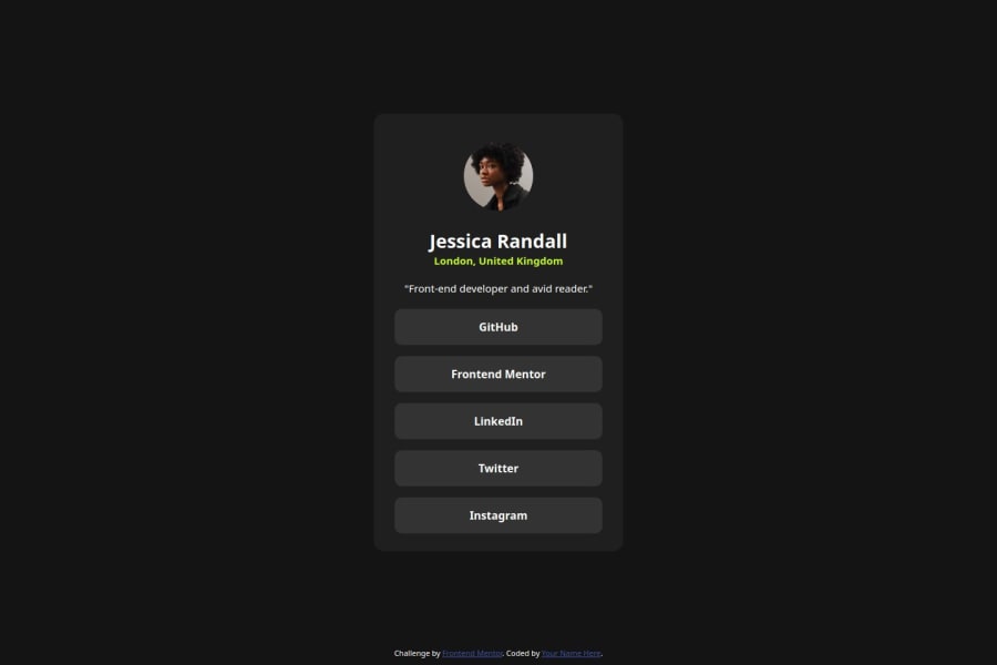
Perhaps the design is a little smaller than the solution, and the use of the assigned font was not correct. It had a better use than mine with respect to semantic HTML, it should improve the initial structure of the CSS styles.
0
Please log in to post a comment
Log in with GitHubJoin our Discord community
Join thousands of Frontend Mentor community members taking the challenges, sharing resources, helping each other, and chatting about all things front-end!
Join our Discord
