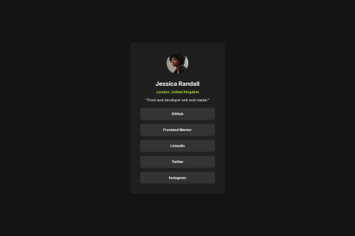
Not Found
Not Found
Not Found
Not Found
Not Found
Not Found
Not Found
Not Found
Not Found
Not Found
Not Found
Not Found
Not Found
Not Found
Not Found
Not Found
Not Found
Not Found
Not Found
Not Found

Submitted

Social Links Profile

@AntonRassanov

Desktop design screenshot for the Social links profile coding challenge

This is a solution for...

  • HTML
  • CSS
1newbie
View challenge

Design comparison


SolutionDesign

Community feedback

P
Steven Stroud 4,100

@Stroudy

Posted

Amazing job with this! You’re making fantastic progress. Here are some small tweaks that might take your solution to the next level…

  • Using a <main> tag inside the <body> of your HTML is a best practice because it clearly identifies the main content of your page. This helps with accessibility and improves how search engines understand your content.

  • I would put these into a <ul> <li>, Like this because it is a list of social links and give more semantic meaning.

<ul>
      <li><a>GitHub</a></li>
      <li><a>Frontend Mentor</a></li>
      <li><a>LinkedIn</a></li>
      <li><a>Twitter</a></li>
      <li><a>Instagram</a></li>
    </ul>

    <a href="#" class="card-link">GitHub</a>
    <a href="#" class="card-link">Frontend Mentor</a>
    <a href="#" class="card-link">LinkedIn</a>
    <a href="#" class="card-link">Twitter</a>
    <a href="#" class="card-link">Instagram</a>
  • Using max-width: 100% or min-width: 100% is more responsive than just width: 100% because they allow elements to adjust better to different screen sizes. To learn more, check out this article: responsive-meaning.

  • Developers should avoid using pixels (px) because they are a fixed size and don't scale well on different devices. Instead, use rem or em, which are relative units that adjust based on user settings, making your design more flexible, responsive, and accessible. For more information check out this, Why font-size must NEVER be in pixels or this video by Kevin Powell CSS em and rem explained.- Another great resource for px to rem converter.

  • Using a full modern CSS reset is beneficial because it removes default browser styling, creating a consistent starting point for your design across all browsers. It helps avoid unexpected layout issues and makes your styles more predictable, ensuring a uniform appearance on different devices and platforms, check out this site for a Full modern reset

  • Using position: absolute is not always best practice because it removes elements from the normal document flow, making layouts harder to manage and potentially causing overlap or misalignment on different screen sizes. Instead, use flexible layout techniques like CSS Grid or Flexbox for more responsive and maintainable designs.

I hope you found this advice helpful! Keep up the great work, and don’t forget to dive deeper into the details. You’re doing amazing, and I can’t wait to see what you create next. Happy coding! 🚀

0
WhyEmBee 50

@WhyEmBee

Posted

perfect layout

0

Please log in to post a comment

Log in with GitHub
Discord logo

Join our Discord community

Join thousands of Frontend Mentor community members taking the challenges, sharing resources, helping each other, and chatting about all things front-end!

Join our Discord