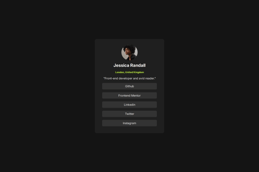
Design comparison
Solution retrospective
I was able to nearly perfect the design without a Figma file.
What challenges did you encounter, and how did you overcome them?Without a Figma file, it was challenging to accurately measure the margins and padding.
What specific areas of your project would you like help with?I would appreciate your help in verifying whether the font size and weight are appropriate.
Community feedback
- P@SaeedAbakahPosted 5 months ago
Good efforts. Check the title of your index.html, i think you need to get rid of the "<h1>" there. Also instead of using individual divs, I think its more useful to use a <ul> to nest all the links and dont forget to add the <a> tag to make them a true link. hope it helps
0
Please log in to post a comment
Log in with GitHubJoin our Discord community
Join thousands of Frontend Mentor community members taking the challenges, sharing resources, helping each other, and chatting about all things front-end!
Join our Discord
