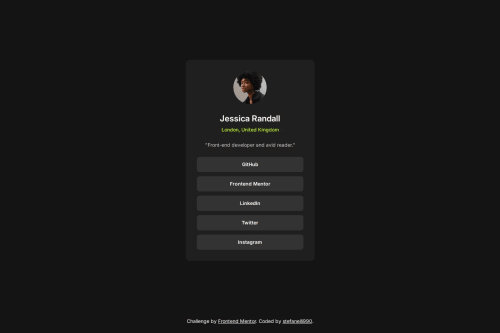
Social links profile

Solution retrospective
I’m most proud of how efficiently I was able to do it using Tailwind. Its utility-first approach allowed me to quickly apply styles and maintain consistency without writing a lot of custom CSS.
What challenges did you encounter, and how did you overcome them?One of the main challenges I faced during this project was the lack of access to the Figma design file. Without a detailed design reference, achieving pixel-perfect accuracy was more difficult. To overcome this, I relied heavily on the design preview provided and meticulously measured visual elements using browser developer tools. I focused on closely matching typography, spacing, and layout, paying attention to small details like padding, margins, and alignment.
Please log in to post a comment
Log in with GitHubCommunity feedback
No feedback yet. Be the first to give feedback on Stefan Mohenski's solution.
Join our Discord community
Join thousands of Frontend Mentor community members taking the challenges, sharing resources, helping each other, and chatting about all things front-end!
Join our Discord