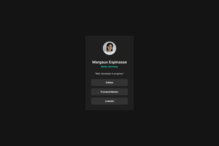
Not Found
Not Found
Not Found
Not Found
Not Found
Not Found
Not Found
Not Found
Not Found
Not Found
Not Found
Not Found
Not Found
Not Found
Not Found
Not Found
Not Found
Not Found
Not Found
Not Found

Submitted

Social Links Profile

P
Margauxβ€’ 120

@margaux-works

Desktop design screenshot for the Social links profile coding challenge

This is a solution for...

  • HTML
  • CSS
1newbie
View challenge

Design comparison


SolutionDesign

Solution retrospective


What are you most proud of, and what would you do differently next time?

This is my third challenge, and I am proud of how much faster I was able to complete it. I have grown more comfortable using Figma, and I truly enjoy leveraging it to create great designs. In the future, I would like to focus on refining my attention to detail and experimenting with more advanced CSS techniques to enhance the overall design.

What challenges did you encounter, and how did you overcome them?

One challenge I encountered was remembering how to set up the hover animation on the links. To overcome this, I consulted external resources and experimented with different animations until I achieved the desired result.

Community feedback

Dylan de Bruijnβ€’ 3,190

@DylandeBruijn

Posted

@margaux-works

Hiya! πŸ‘‹

Congratulations on your solution, it looks very close to the design! I can tell you put a lot of effort into it.

Things I like about your solution πŸŽ‰

  • Use of semantic HTML elements
  • Clear descriptive CSS classes
  • Use of CSS custom properties

Things you could improve ✍️

  • I suggest adding a bit of padding to your body element so the card has some space around it on smaller viewports.

  • You could add a min-height: 100vh to your body element so it takes up the full height of the viewport while still being able to grow when the content inside it grows.

  • Try using using relative CSS units like rem and em they make your layout more adaptable.

  • Try putting your links in a list (ul) to make your code more semantic.

  • You don’t have to wrap your image in a separate div, it’s possible to style it directly to achieve the same result.

  • To make your image round you can also write border-radius: 50% instead of border-radius: 999px.

  • Try experimenting with the Flexbox gap property.

I hope you find my feedback helpful! 🌟

Let me know if you have more questions and I'll do my best to answer them. πŸ™‹β€β™‚οΈ

Happy coding! 😎

0

P
Margauxβ€’ 120

@margaux-works

Posted

@DylandeBruijn

Hi Dylan,

thank you so much for the super detailed feedback, I really appreciate it 🀟🏻

I have implemented all the optimisations you suggested, that was fun :) I am happy I could update my code with REM (first time using them properly) without running into any issue.

For the gap property, I was already using it on the social-links class. Do you see any other places where I could be using it?

Thank you again πŸ™πŸ»

Cheers, Margaux

1

Please log in to post a comment

Log in with GitHub
Discord logo

Join our Discord community

Join thousands of Frontend Mentor community members taking the challenges, sharing resources, helping each other, and chatting about all things front-end!

Join our Discord