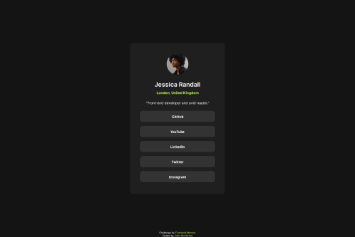
Social links profile

Solution retrospective
I'm happy I have done another Frontend Mentor challenge! I will aim to do another one this week and try to increase my output even further within the next month.
What challenges did you encounter, and how did you overcome them?I wanted to go beyond what the challenge was asking, just something a little extra, so I have put icons and some minor animations on each button.
What specific areas of your project would you like help with?I've seperated my CSS with comments into different parts: CSS reset, Tags and Classes. I'm not sure if this makes it more readable but it was all getting a bit messy as I was building the challenge. Is there a standard way everyone does it?
Please log in to post a comment
Log in with GitHubCommunity feedback
No feedback yet. Be the first to give feedback on John McNichol's solution.
Join our Discord community
Join thousands of Frontend Mentor community members taking the challenges, sharing resources, helping each other, and chatting about all things front-end!
Join our Discord