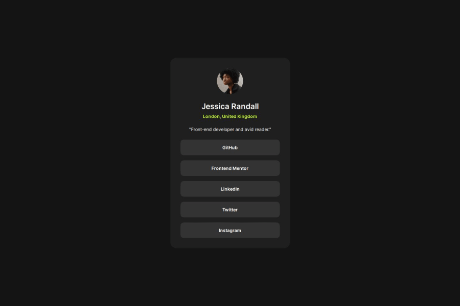


Design comparison

Community feedback
- @5nufkinPosted 2 months ago
Hi there, Your website looks good and it's pretty responsive. One thing I notice right away is that you called both the
.htmlfile and the.cssfile 'index' which creates confusion. You should consider using the namestyle.cssorstyles.csson the.cssfiles. Also - index.html is used so that browsers know this is the home page of the website, whenever you click a website's link on google or any other search engine you're being directed to the index.html file, so that's one more thing to bring into account when creating multiple pages websites in the future. In the html file, your use ofdivs could have been a little better - for example: instead of surronding theimgwith adivwith aauthour_imgclass, you could have created adivfor the whole info section and putting the<img>tag inside of it. Another example is that you didn't put the<p>and<ul>tags in adiv, if you decided on putting each tag or each few tags in their owndivinside thecard div, then you should keep following this structure throughout the whole project, it makes the more much more readable. I would also consider adding padding to the.containerso it doesn't touch the sides of smaller screens. One more thing - you only used classes for you tags and didn't use any ids, for tags that you only have one of in your html - for example the card div - you should use ids and not classes which is more semantically correct. You did a good job and should be proud of yourself! I hope these few little adjustments I pointed out would help you take it to the next step.Marked as helpful1

Please log in to post a comment
Log in with GitHubJoin our Discord community
Join thousands of Frontend Mentor community members taking the challenges, sharing resources, helping each other, and chatting about all things front-end!
Join our Discord