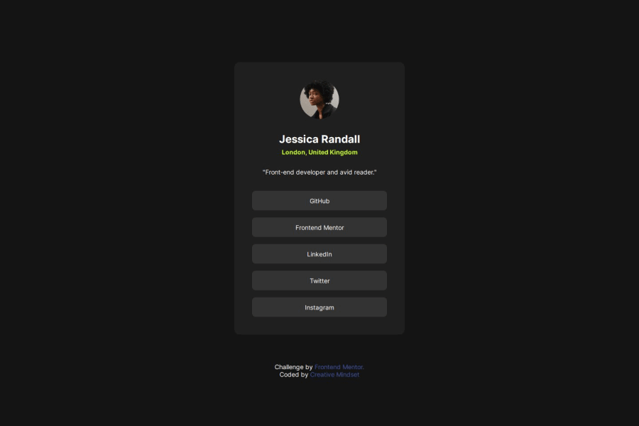


Design comparison

Please log in to post a comment
Log in with GitHubCommunity feedback
- @grace-snow
I'm afraid this is overflowing my screen at the sides and making some common beginner errors we see a lot. Hopefully these points help.
- Keep the html as simple as possible. Remember this is only a single card component that should sit within the main landmark on the page. That means it's a div or section with img, heading, paragraph, blockquote and list of links inside it. You don't need all the extra divs and sections. All that does is make the styling harder and bring no benefit.
- the heading is the main heading for the page so I'd expect It to be a h1 in this instance.
- the image description isn't bringing any benefit so I'd recommend treating it as decorative instead with an empty alt attribute.
- get into the habit of including a full modern css reset at the start of the styles in every project you do. Look up Andy Bell's modern css reset.
- the card mustn't have an explicit width. Give it a single max width in rem instead so that it can go narrower when it needs to (like on smaller phones).
- make sure you're choosing units intentionally. I doubt you really want to use rem for the card padding (unless it was part of a clamp or min function with other units). Using rem means that padding will increase along with the user's text size setting in their browser or device, so you can end up with a very narrow area for the content. Using px for this padding would mean it is a fixed value so that wouldn't happen.
- similarly, give the body or main a little padding on all sides so the card can't touch the screen edges.
- there is no need for any media query in this. You can delete that.
- make sure you're styling the links as you should be and not the list items. It might be fine but looked like the links may be small and not have the hover styles when I read the code.
Overall the css just looks complicated for what is here. But I think that's because of the extra complexity added in the html. Once the markup is simpler the styles should become simpler too.
- @YOUSSEF-ETTABAA
This solution is visually appealing with responsive design, semantic HTML, and modern typography using Google Fonts. The hover effect adds interactivity, and the structure is well-organized. However, accessibility could improve with better alt text and contrast, and the CSS could be optimized for simplicity. Overall, it's a solid, functional design with minor areas for enhancement.


Join our Discord community
Join thousands of Frontend Mentor community members taking the challenges, sharing resources, helping each other, and chatting about all things front-end!
Join our Discord