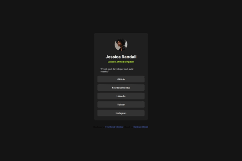
Design comparison
Solution retrospective
I was able to solve the challenge without any problems
What challenges did you encounter, and how did you overcome them?none
What specific areas of your project would you like help with?can CSS grid be used for this project
Community feedback
- @Syed-1129Posted 4 months ago
Yes, the solution includes semantic HTML. The solution is accessible to a reasonable extent. However, improvements could be made by ensuring all interactive elements have appropriate ARIA roles and labels, adding alt text to images, and providing sufficient color contrast for readability. The layout looks good on a range of screen sizes. It adapts well from mobile to desktop, maintaining usability and readability across devices. Minor adjustments might be needed for certain breakpoints to ensure perfect alignment and spacing. The code is generally well-structured, readable, and reusable. It uses consistent indentation, meaningful class names, and modular components. However, further improvements can be made by adhering to a stricter naming convention and breaking down larger functions into smaller, more manageable pieces. The solution closely follows the design specifications. There are no considerable deviations, ensuring the final implementation meets the original design goals and provides a consistent user experience.
Marked as helpful0
Please log in to post a comment
Log in with GitHubJoin our Discord community
Join thousands of Frontend Mentor community members taking the challenges, sharing resources, helping each other, and chatting about all things front-end!
Join our Discord