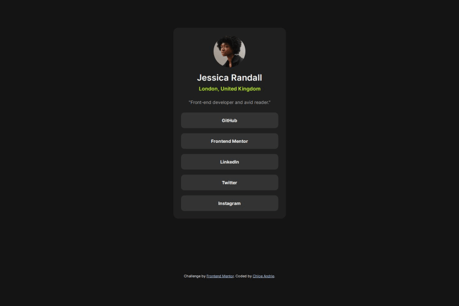
Design comparison
Solution retrospective
I'm proud of completing another Frontend Mentor challenge! Looking forward to increasing the difficulty of challenges as I gain experience.
What challenges did you encounter, and how did you overcome them?I had difficulty with the sizing and spacing of elements. I did not access the Figma files, so I had to estimate. I wasn't sure what the hover and focus states were meant to look like for the interactive elements, so I made up my own.
What specific areas of your project would you like help with?I'm continuing to work on accessibility and correct semantics. What would you change or do differently?
Community feedback
- @DanielClement37Posted 12 months ago
It seems great and 1 to 1 other than the container not being centered vertically. Another thing I would change is that i would add class names to all the html tags that are being styled so that in the case of another h1 or h2 needing to be styled you can use it's class name with
.insert-class-name-here {}or there are also IDs you can give to elements where you can style them with#insert-ID-name-here {}. these will help with specificity of elements as pages get more complex.Marked as helpful0
Please log in to post a comment
Log in with GitHubJoin our Discord community
Join thousands of Frontend Mentor community members taking the challenges, sharing resources, helping each other, and chatting about all things front-end!
Join our Discord
