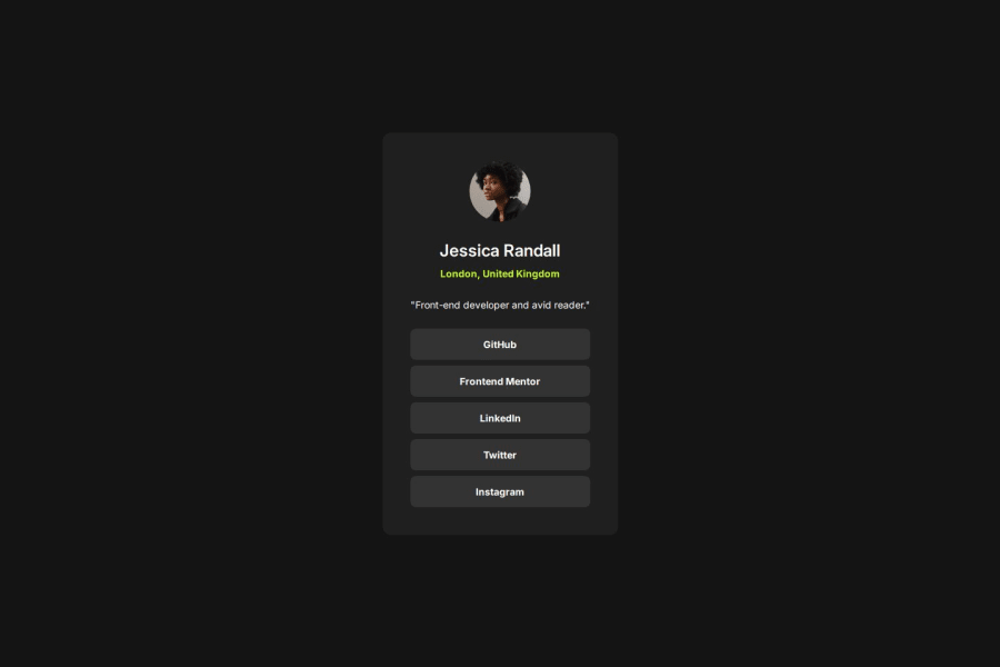
Design comparison
SolutionDesign
Solution retrospective
What are you most proud of, and what would you do differently next time?
It was easier for me to complete this challenge compared to the first time.
What challenges did you encounter, and how did you overcome them?I guess the only problem I had was centering the card. I forgot to set a height and it took me sometime to realize that it's the reason why my card is not in the center despite using margin and flexbox properties.
What specific areas of your project would you like help with?I use px in my css. I want to ask for people who use rem. How do you ensure that you get the exact measurement when you are writing code based on a Figma design? Is it ok if it's not pixel perfect as long as it's very close to the design? Do you set a base rem unit or just use the default?
Community feedback
Please log in to post a comment
Log in with GitHubJoin our Discord community
Join thousands of Frontend Mentor community members taking the challenges, sharing resources, helping each other, and chatting about all things front-end!
Join our Discord
